10 Best Optician Website Designs of 2025
Is your current website starting to look outdated? Maybe your practice website is getting a little stale compared to others in your area. But don’t worry, we’ve got good news! This blog offers a dose of some much-needed inspiration on the latest optician website designs. Pick things up for your practice this year with a refreshed online presence to make a great first impression on your website visitors.
Why is your website so important anyway? Well, to start, the vast majority of people now rely on a search engine like Google before deciding which establishment they want to visit. This includes everything from a nearby restaurant to the practice they want to visit for their new prescription glasses. Several components go into a solid digital marketing strategy to ensure an optician practice appears on at the top of Google in a prospective patient’s search results. In short, you want to have a presence on social media, keep up good reviews, use effective email marketing, and most importantly, maintain a solid website.
Investing time and resources in your optician practice’s website is essential, so don’t be afraid to try something new to bring in a steady stream of new patients through your doors. Here are the best optometry websites to help your practice find the ideal design. Plus, additional tips and eye health resources to know to make your site stand out in your area.
The Best Optometry Websites to Inspire Your Next Redesign
A professionally designed website isn’t just about aesthetics—it’s about function, speed, and mobile optimization. These top optometry clinic websites highlight how modern design, user experience, and visual branding can work together to attract and convert more patients. Whether you’re updating your current site or starting fresh, these examples will give you the inspiration you need.
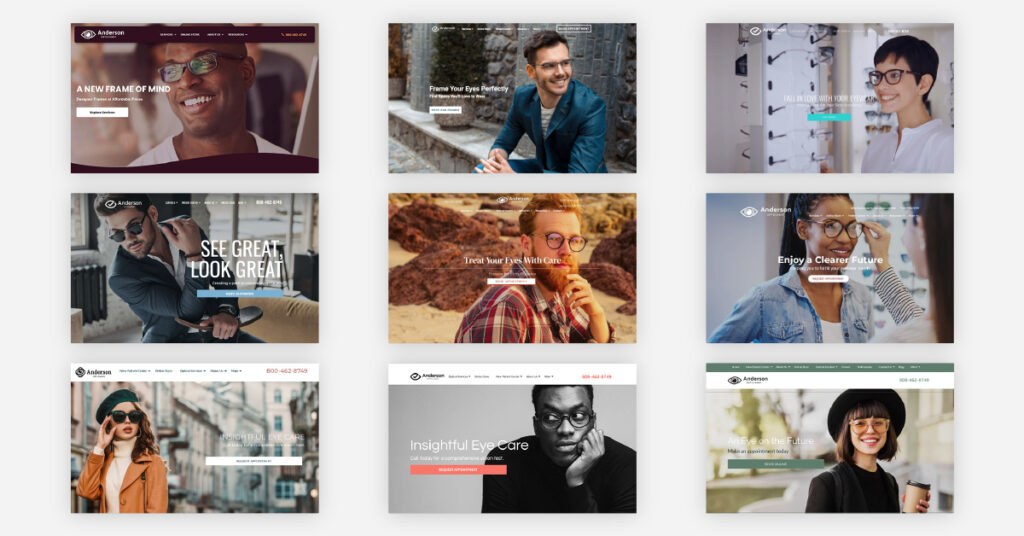
1. Acadia – Polish Your Online Presence with a Classic Layout
Does your practice provide the best eyewear in town? Show off your inventory with a stellar online store. Think of your website as a digital profile that highlights your best services or online store. Acadia is a great website design if you want a design that has an emphasis on simplicity. It’s a clean and user-friendly design that’s free of any distractions and easy for visitors to navigate. This website has a minimalistic touch so that it can be inviting to users without any distractions. This layout also has a symmetrical line design to add depth and uses a lighter color palette, which are essential design elements often associated with vision care.
2. Sierra – Incorporate Practical Eye Wear on your Homepage
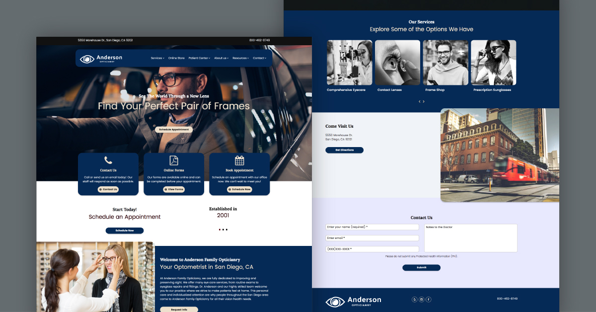
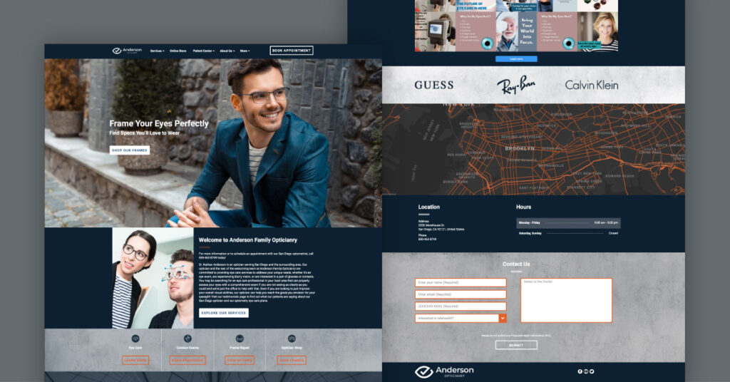
A great web designer understands how to get relevant information across to potential clients without overloading the eye. Our modern Sierra design showcases a simple image up front – a patient driving with his glasses. Not your style? Just swap it for something more your own. This design makes any image instantly resonate with your patients, looking for both practical and stylish eyewear they can use in their everyday lives.
It’s a rather simple, straightforward layout with all the main features your practice needs. As potential patients scroll down, they’ll see a menu section for contact details, booking, high-quality images, and online forms. Most healthcare professionals lean towards websites that use white and blue colors because they tend to look the most professional. This particular design features a deeper navy blue that looks great against the black and white bio images.
Click here to view this design
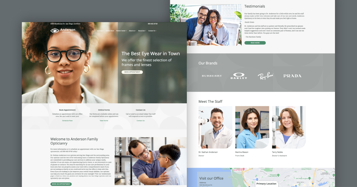
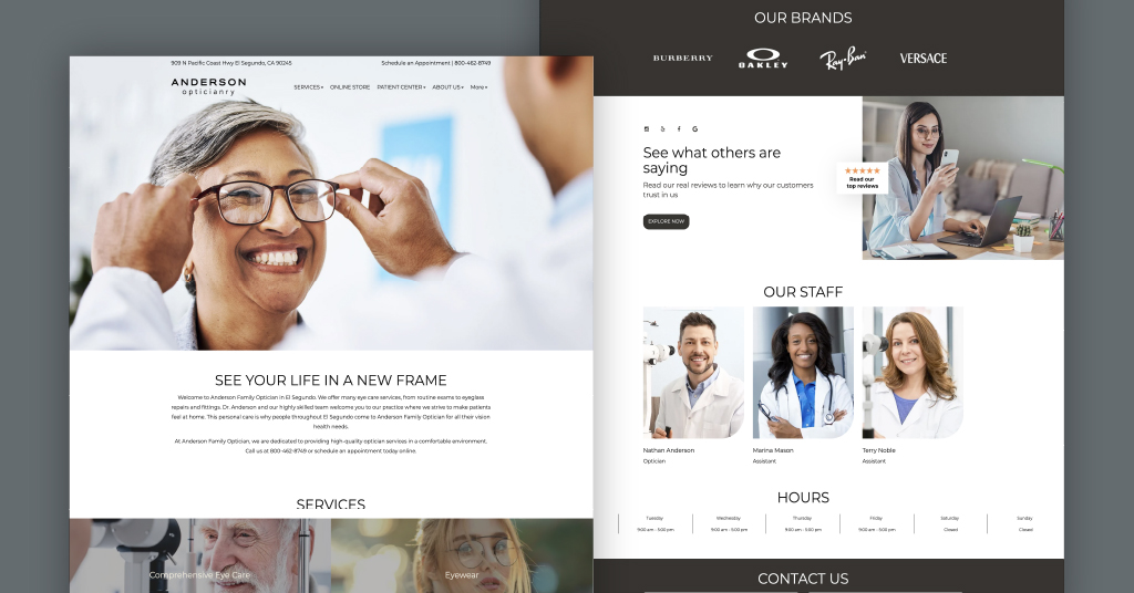
3. Harrisburg – A Website That Incorporates Dynamic Video
Your website’s homepage is one of your best tools for driving conversions. Video is quickly taking over the web and becoming the future of online marketing. That’s why we created Harrisburg, this eye doctor-oriented website design shows a video of an optician helping a patient shop for eyewear frames.
This video does a great job of portraying a patient’s experience coming in to buy a new pair of glasses. It’s a good example of what type of relevant content to incorporate into your website that will resonate with patients. Use this design for you if you want to promote your online shop and try something new.
Once you scroll down, you will learn more about the doctor and staff. To the left, you will see a signup form to receive newsletters and new patients get a free consultation. All must-have features worth of including in your website design.
Further down, in the section titled “See what others are saying,” you’ll find patient testimonials—real stories from satisfied patients that add credibility and help new visitors feel more confident in choosing your practice.
Click here to see Harrisburg Website Design for Opticians
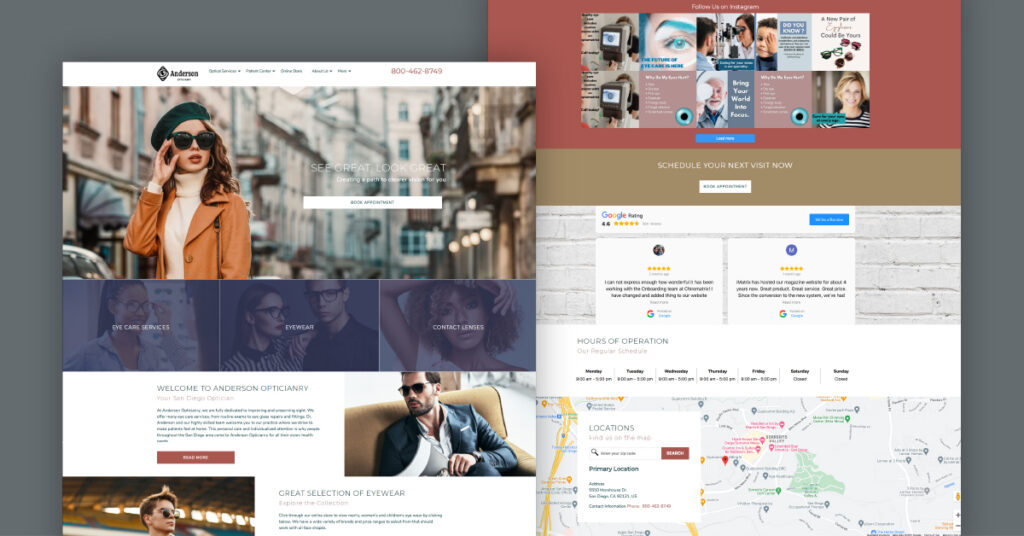
4. Carmel – Play With Rich and Sleek Colors
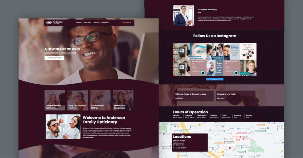
Most eye care websites use shades of blues and grays since these are universally accepted colors viewers associate with the medical industry. However, as an optician with a stellar selection of the latest eyewear and contact lenses, you can really experiment with color both online and inside your shop.
Here’s a website design that really pops with a rich, uncommon burgundy color. The color adds dimension right away to the design by contrasting it with the stock images that have a lot of white in them.
In addition to color, the overall design is sleek and clean. A little detail in the menu is the incorporation of more visuals. This design is bold with its darker color scheme, creating a strong look.
This is especially useful for eye care professionals who want their brand to stand out while maintaining a sense of professionalism.
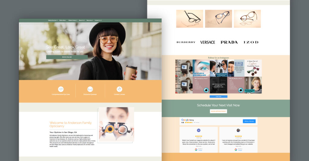
5. Sedona – A Warm & Inviting Landscape Website Design
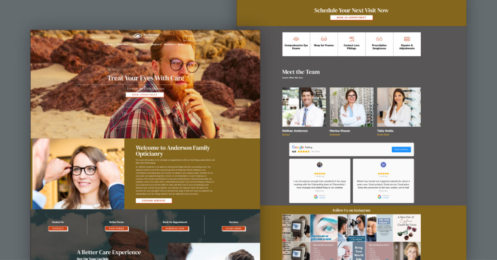
Here’s a website design that’s sure to be a favorite. If you want a smart optometry design with a warm and exciting look and feel this lively design is the one for you. Covered in shades of brown and yellow this design is very visually appealing. Sedona evokes images of a beautiful desert landscape, where its potential really stands out.
It’s a design that helps display eyewear as a part of patients’ lives. This theme has an earthy, warm, inviting vibe that patients would like, perfect for pairing with other aspects of your practice. Why not use your website to highlight your office’s positive influence on patients’ lives every day?
6. Brooklyn – Elevate Your Website With An Urban, Industrial Design
Take a step back and consider your practice’s location. Is it in the middle of a busy metropolitan city? Or in an industrialized area where several corporate businesses are located? You may be surrounded by an urban community with young workers. If that sounds just about right, then we have a great website design for you called Brooklyn.
You want your website to cater to patients in your area. They may be busy millennials and young entrepreneurs working in the tech industry who could be on their way to grab a morning coffee and walking by your practice. Draw that imagery and energy into your website design to attract more prospective patients looking for glasses.
Use the homepage image to appeal to your website visitors. Additionally, you can highlight a local fixture on the map section to make your website connect more with your local community.
7. Stumptown – Sleek Design With a Fun Pop of Color
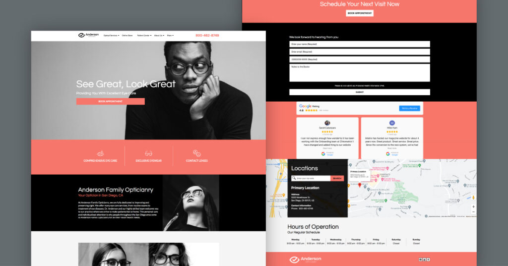
See Stumptown for a optometrist website design that is sure to stand out to any prospective patients in your area. Here we have a design that uses contrasting colors of black and white with vivid pops of color to add some flair. This salmon-like shade of pink gives the website a very polished and high-quality appearance.
One of the stand-out features of this design is also the chic black-and-white photography. While this may seem counterintuitive to not show the color of your eyewear products, this couldn’t be further from the truth. This is a design meant to evoke a specific luxury look and feel. Perfect for any visitor who wants the latest eyewear from higher-end brands like Prada, Ray-Ban, and Armani Exchange.
If something with clean lines and a minimalistic feel sounds great, then the stylish colors and images on this design are sure to please. Just remember, whatever design you decide on, it’s important to take note of the color, as well as the overall responsiveness on a mobile device.
Click here to see Stumptown Website Design for Opticians
8. Albany – A Trendy and Stylish Boutique Theme
This is a beautiful design that has a real emphasis on appealing to luxury brands. This optician website design is called Albany. This design appeals to young visitors who may be more interested in your practice’s online shop. This optician-oriented design has a very trendy and stylish look and feel that would attract a diverse group of patients.
If your practice also has a great variety of eyewear and offers more luxurious brands like Prada, IZOD, or Burberry, this is a design that could put emphasis on them.
Images not only add life to a website, but they also make it convert better. Take a look at the homepage image. A fashionable approach to eyewear that helps present your eye care services, which can be very intriguing to your targeted audience.
9. Perris – Attract More Patients With Simplicity
It doesn’t hurt to have options. So if you’re looking for something that has some similar elements to what is mentioned above, then check this out: see the optician version of Perris. This design also has a stylish boutique feel. It’s the perfect layout to promote your eyewear shop if you’re offering the trendiest brands.
If a website design appears too cluttered and messy, it’s visually unappealing. This is typically one of the leading reasons a visitor leaves a business site right away. So, instead, give your optician practice a well-deserved web design makeover. Perris is a great clean option that has a great mix of small details and more subtle colors that evoke a friendly atmosphere.
10. Del Mar – Next-Level Design Elements
Our Del Mar design is one of the best eye care websites currently available. Why? Because Del Mar was created with a focus on sleek functionality and modern design. From the simple and clear colors to the focus on easy navigation, this website design has everything needed for patients to learn about your practice.
You can use sections to showcase the brands you offer at your practice or even patient testimonials to highlight what patients think about their visits. With ample space for adding high-quality content like blogs, educational content, and informative articles, Del Mar is on the cutting edge of website designs for eyecare professionals.
Get the Latest Website for Your Practice With iMatrix
By choosing one of our website designs, you’ll be able to customize your optician site to meet your practice’s needs. Want to view more website designs? Explore our vision care gallery here.
If you’re looking for an eye care website that will elevate your practice to new heights then give us a call at 888.792.8384 or click here to receive special pricing on our website services.