9 Best Optometry Website Designs of 2025
Most website visitors decide within mere seconds whether or not they want to remain on a website or exit it. Make no mistake, first impressions matter – especially online. It should be no secret that a stellar optometry website design can do wonders for your practice. You can think of it as a digital version of your practice accessible to potential patients.
An effective website design will attract patients instantly by grabbing their attention. Of course, you want to have a site that is friendly for mobile devices. As well as a website that puts an emphasis on being easy for visitors to navigate with accessible and modern features.
Patients should be able to quickly see the services you offer, request an appointment, see positive reviews about your practice, and learn more about your staff. Important information such as your practice locations, addresses, hours of operation, and phone numbers should be easily visible within a great website design.
Remember that your new website works as a platform for valuable eye care information. We have gathered the best optometry websites to help your practice find a design with the right look and feel.
Want to see all of our designs? Click here to explore our eye care gallery here. Our gallery can help your practice choose the best website design that will meet all your needs.
1. Use Color for an Eye-Catching Website Design
One of our favorite parts of the website design Sierra is its cohesive color palette with a stunning forest green. As a practice, we encourage you to lean on your location or aesthetic for inspiration in your website design. For fans of brick architecture in urban or smaller city communities, this diverse design is sure to catch many visitors’ attention.
2. Get a Website with a Modern Design
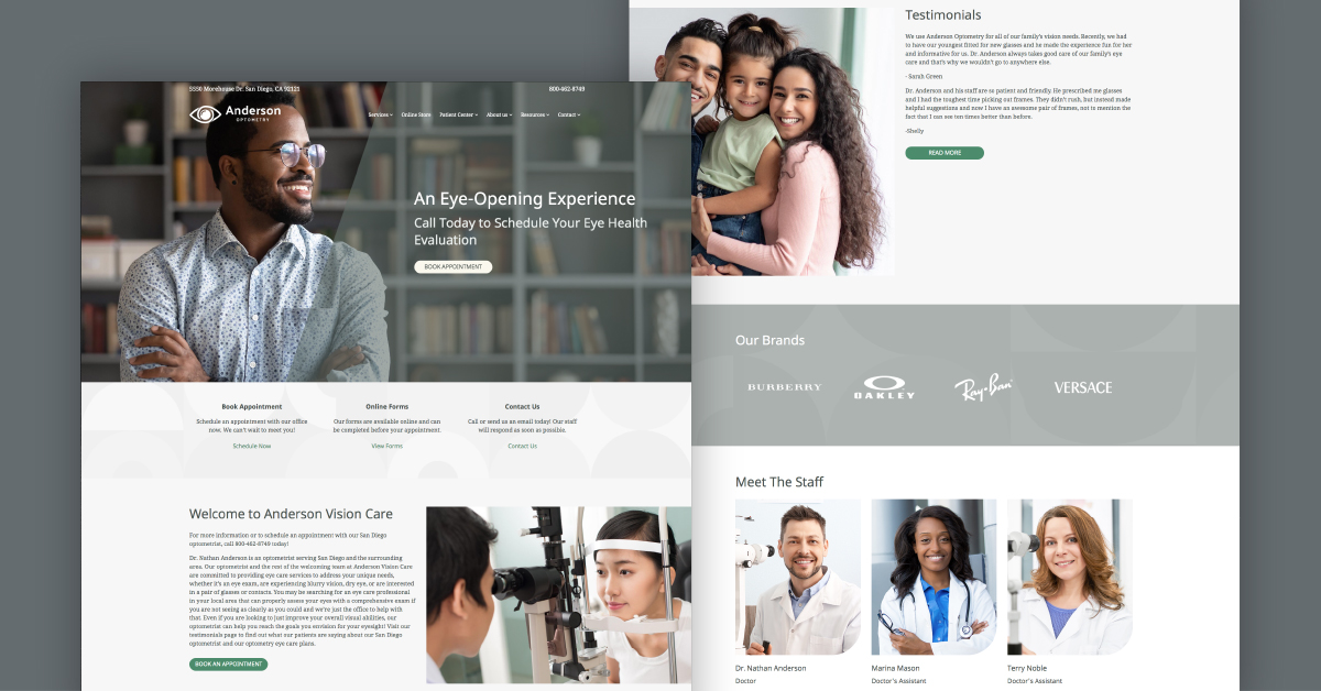
Switching things up with a new optometry website will do wonders for your practice. After all, ensuring your website is performing well is essential to your digital marketing strategy. So what do you want to look for in a new website? A great option to keep your website professional is to go for something with clean lines and dark colors.
Carmel website design would be a great choice that delivers a fresh modern feel. Here’s a website that’s simple and easy for visitors to navigate. Plus you always want to have a visible call-to-action (CTA) button. For example, it says to see “Book an Appointment.” Using a darker color scheme and having a visible CTA button assists the website in successfully converting visitors into patients.
In this design, when a visitor scrolls down on the homepage you can see a menu with more images on other pages. A section for contact lenses, prescription glasses, and your eyewear store. This menu looks sleek and clean and provides lots of space to add a personal bio.
SEE CARMEL DESIGN IN ACTION HERE
3. Make a Strong Impression with a Simplistic Design
It’s no secret that the key to your online presence is truly a great website. It only takes seconds for your website to capture a visitor’s attention. When in doubt opt for a design that is simple and gets to the point. Display your practice name in large font with a call-to-action button “book an appointment” to remind patients that they schedule for their next eye exam.
Acadia, for optometrists, is designed to be easy to navigate for both desktop and mobile. This professional website is sure to make a good impression on any eye care expert that prefers light colors and a clean layout.
SEE ACADIA DESIGN IN ACTION HERE
4. A Website Design That Incorporates Dynamic Video Background
What better way to stand out than by incorporating an innovative video into your homepage? The homepage is the face of your website. It serves as one of your best tools for driving conversions. Video use is quickly taking over the internet and becoming the future of online marketing. Videos are also great for conversions because they keep visitors on your site longer.
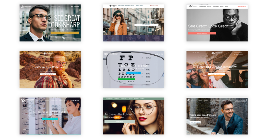
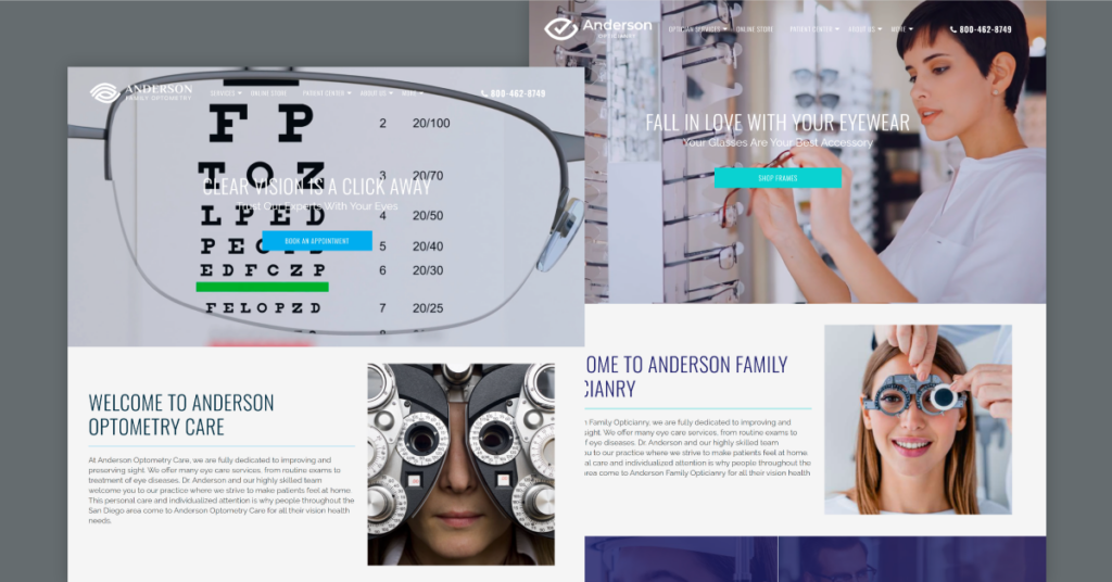
The first design to highlight is called Harrisburg, where you can find a great example of a multi-dimensional video that will grab visitors’ attention. This video shows an eye chart through the lens of wearing glasses being clear and visible and then removes the glasses lens to show the eye chart blurred. Any patient searching for an eye care practice will immediately resonate and have further incentive to make an appointment by watching this video.
In the optician-oriented Harrisburg website design, visitors would see a video depicting a patient shopping for eyewear frames. This video does a great job of portraying a patient’s experience coming in to buy a new pair of prescription glasses. It’s a good example of what type of content to incorporate into your website that will resonate with patients. This is the design for you if you want to promote your online shop and try something new.
SEE HARRISBURG DESIGN IN ACTION HERE
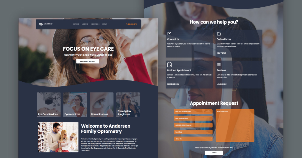
5. Elevate Your Website With An Urban, Industrial Design
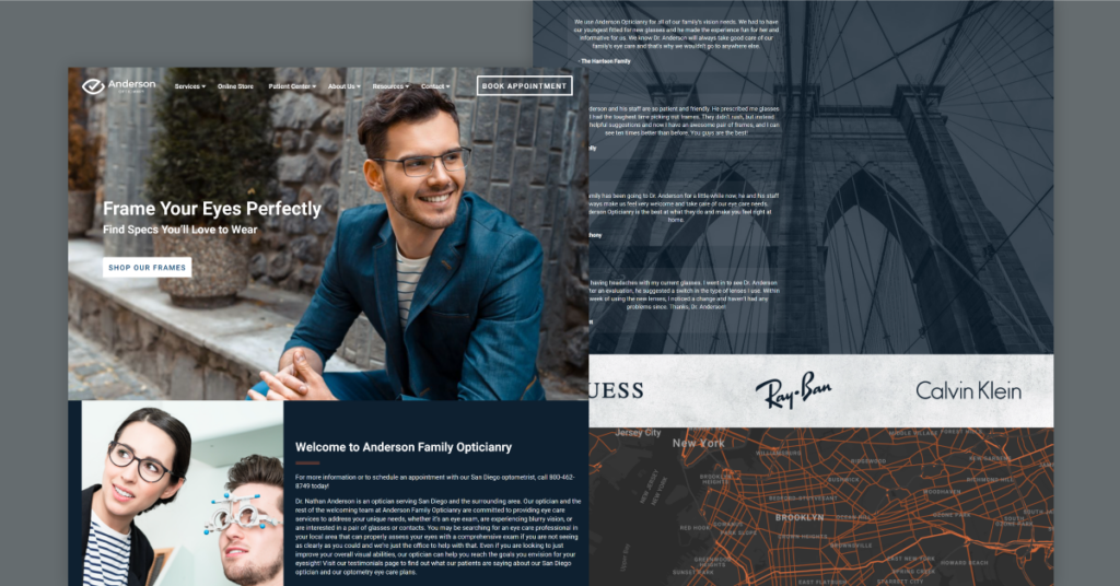
You have probably heard this phrase before, “Location, location, location,” often used to describe a property’s value. Here we want to take a closer look at how the location of your optometry practice should contribute to your optometry website’s graphic design. If your practices’ location is front and center in a downtown area, then we have the perfect gorgeous website for you.
See the Brooklyn theme, which offers an industrial and urban feel. Think about your neighborhood and the audience your website can reach. Tie your website design to cater to the lives of patients in your area. Set the image, think about the working millennials working in the tech or corporate industry near you that grab their morning coffee. What do these business-oriented potential patients also have in common? They probably need glasses and need to get their eyes examined annually.
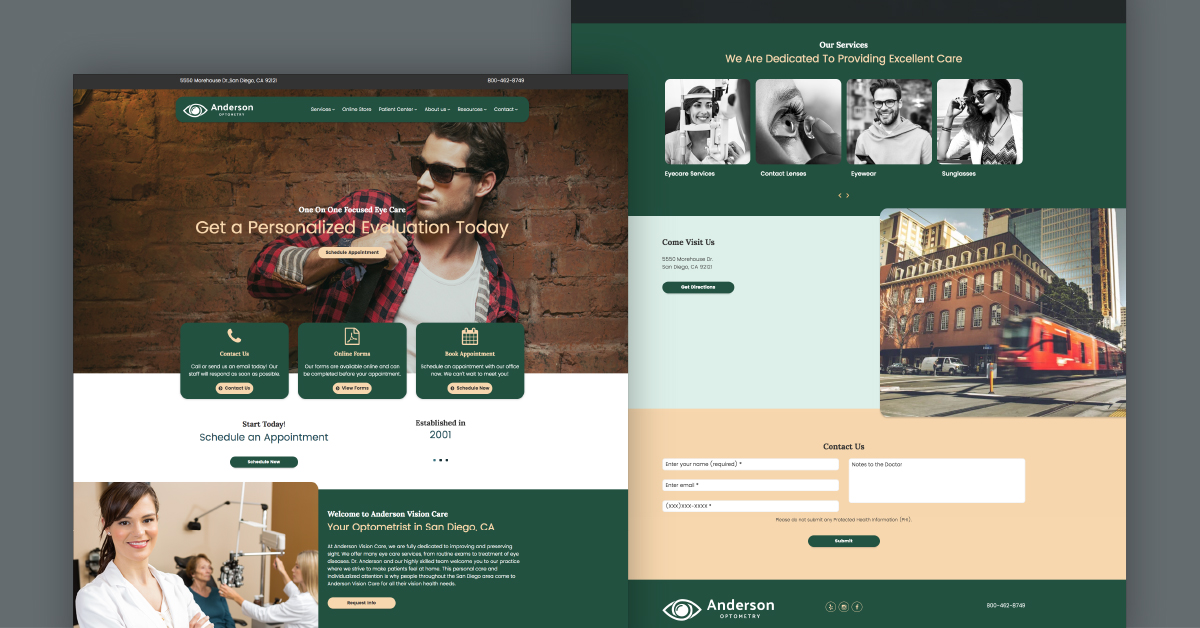
6. Sedona – A Warm and Inviting Landscape Website Design
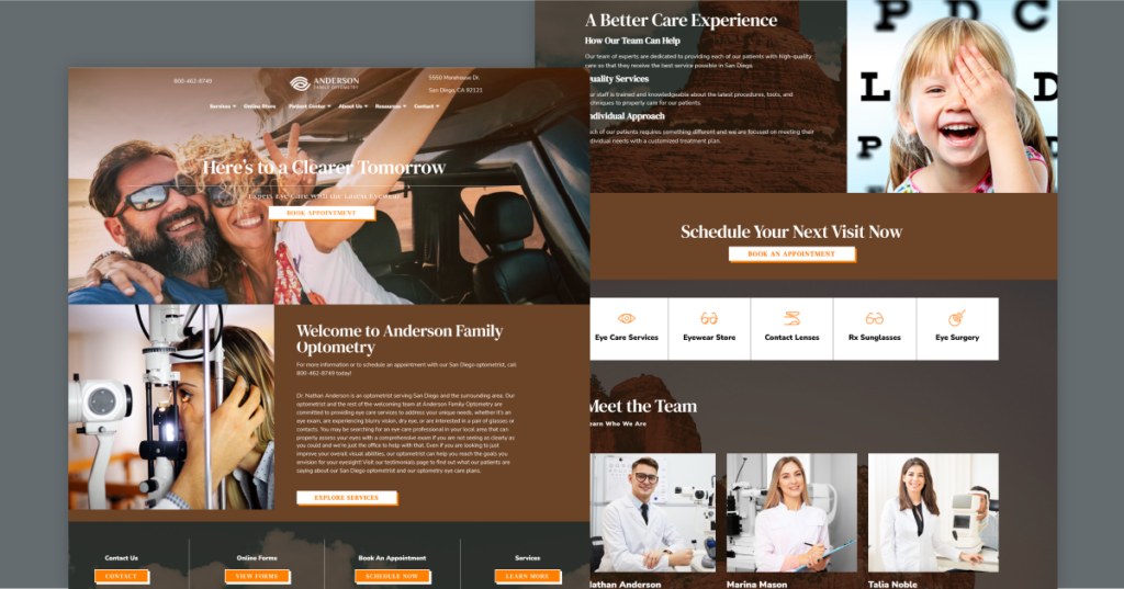
If your practice is located in a more rural area away from the hustle and bustle of a noisy city, lean on landscapes for inspiration. Beautiful landscapes are often very pleasing to our eyes. Adding an element of adventure into your optometry website design is a great way to entice more patients to explore your practice’s information.
Click here to see the Sedona optometry website design, which offers a lively and inviting landscape theme. This attractive design uses warm colors like different shades of brown and auburn to create an earthy vibe. This grounded theme takes inspiration from road trips to wild and hot deserts.
Another design point worth noting is its vivid photography. Here we have images of patients smiling with their new glasses while out and about on a new adventure. Patients’ eyesight affects their daily lives. Every patient coming to get an eye exam of sorts seeks to take care of their eyes. Your optometry practice makes a positive impact on patient’s lives every day, so why not celebrate this on your website?
SEE SEDONA DESIGN IN ACTION HERE
7. A Website Design that Features Illustrations Instead of Traditional Photography
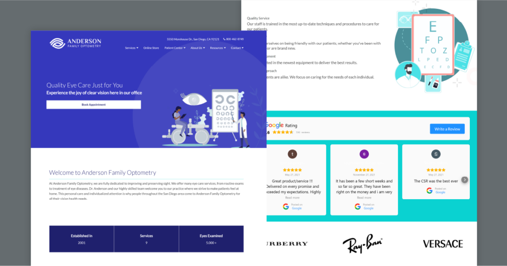
If you’re looking for a unique idea to mix things up, try opting for a new website design that incorporates illustrations instead of more traditional stock images. See the Summerville optometry website design where you can find a bright blue homepage with an illustration depicting a patient having an eye exam with their optometrist.
Illustrations are a fun way to play with the visuals of your website and tell a story. A graphic design like this would definitely stand out among other optometry practices in your area. If you want to try a unique approach to your optometry practice website design, give illustrations a try.
These illustration vectors are multidimensional and can depict more information like infographics than traditional photography. Another bonus of this design is the complementary blue and white color scheme, which looks very professional for your eye care services.
SEE SUMMERVILLE DESIGN IN ACTION HERE
8. Black and White With a Pop of Color Website Design
One of the best optometry web designs hands down is Stumptown. Attract more patients with a homepage that has a captivating color scheme. The black and white colors look very chic and clean. Adding this pink pop of color to the website gives the design a high-quality look and feel.
A great design also wants to attract the viewer’s eyes to a call-to-action (CTA) button and have that be pretty visible. This color scheme really draws the eyes right away to the “Book Appointment” button. It’s important to put an emphasis on these CTA buttons because converting visitors into patients is always one of your website’s main goals. This website design will also work great for a mobile device.
This design looks very fresh since is very minimalistic and uncluttered which is often one of the leading reasons a visitor might leave a website. Whatever optometry website theme you decide on remember to keep the color scheme in mind. Color does correlate with emotions for website visitors.
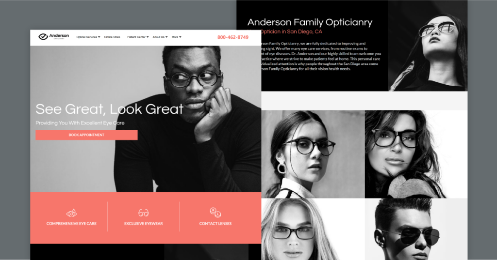
9. Give Your Website a Stylish Boutique Look and Feel with Coronado
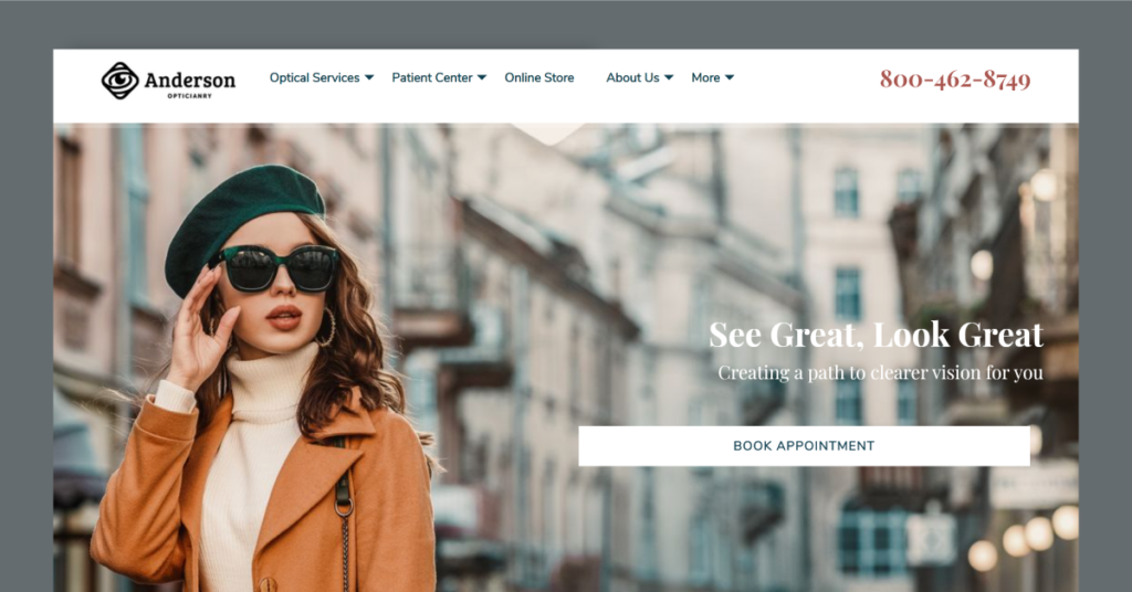
Here’s a gorgeous website design to try and stand out, see Albany. This design has a very trendy and stylish look to inspire your practice. This design appeals to young visitors that may be more interested in your practice’s online shop. This optician-oriented design has a very trendy and stylish look and feels that would attract female patients.
If your practice also has a great variety of eyewear and offers more luxurious brands like Prada, IZOD, or Burberry this is a design that will put emphasis on this. Images not only add life to a website, but they also make it convert better. Take a look at the homepage image. A fashionable approach to eyewear and eye care can be very intriguing to your targeted audience.
This design similarly has that stylish boutique feel. This is the perfect layout to promote your eyewear shop if you’re partnered with dozens of trendy brands.
Get the Latest Website For Your Practice With iMatrix
By choosing one of our website designs, you’ll be able to customize your optometry site to meet your practice’s needs. Want to view more website designs? Here are more design ideas to try and stand out, explore our vision care gallery here. Attract new patients by having full digital marketing services that offer low cost solutions. These efforts improve your practice’s Google search engine results and more.
If you’re looking for an optometry website that will take your optometry practice to the next level there then give us a call at 888.792.8384 or click here to receive special pricing on our website services.