7 Ways to Improve Your Practice’s Chiropractic Landing Page
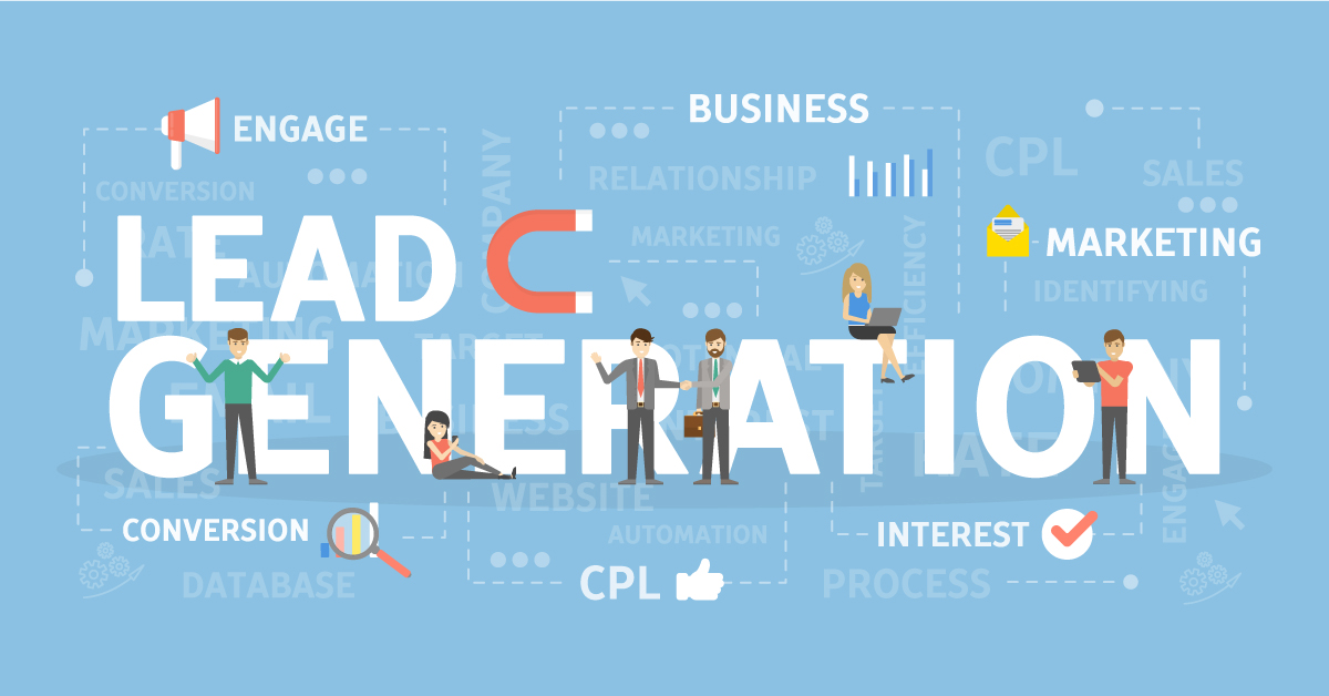
Did you know that the phrase “near me” appears in searches for Chiropractors at an average of 673,000 searches every month? How can you capture quality leads like those searching for your services? You need a stellar chiropractic landing page.
Driving traffic to a specific part of your website, your chiropractic practice page, for example, may sometimes seem challenging. Even when you put in the time and effort, there are times when something is still not clicking. In this case, it might be time to take a look at revamping your chiropractic landing page.
If your chiropractic landing page does not convert leads into long-term patients, what should you do? Well, this blog post is for you. If you are a chiropractic professional, generating website traffic and turning those visitors into leads can be done by having a landing page that works well.
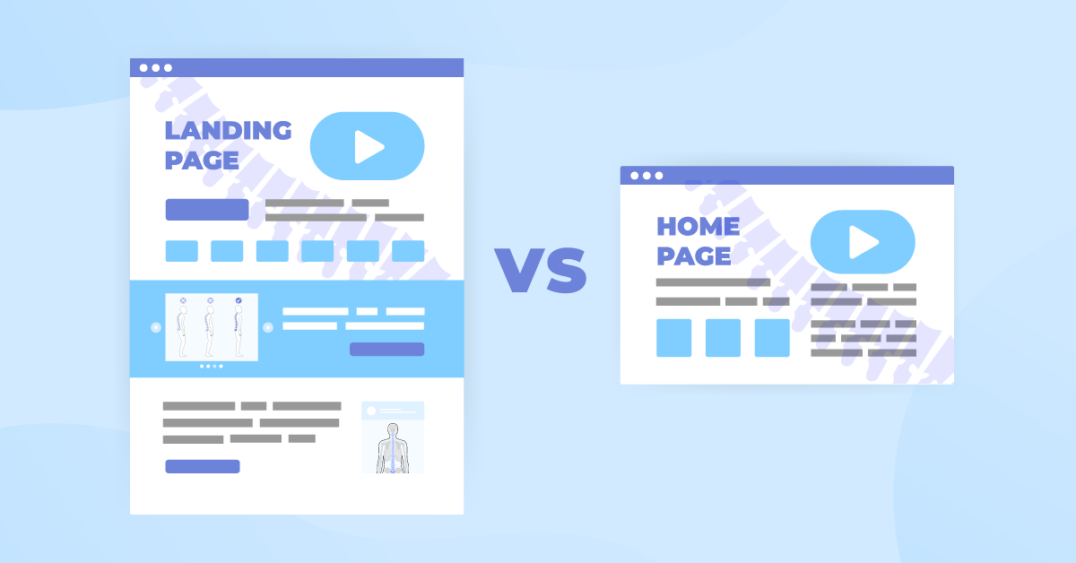
What is a Landing Page?
To clarify, a landing page is part of a website; it is a standalone page designed to promote a specific action. It is a page that has a purpose, for example, to turn anyone who wants to know more about your chiropractic practice into new patients. It can show a simple design asking visitors to complete a form or sign up for an account in exchange for a piece of contact information.
Chiropractic landing pages do not normally allow you to click on the ‘Contact Us’ or ‘Services’ tabs unless you follow through with the needed information. But not all online searchers stay and give you the desired results. Here are our seven tips to help every chiropractor create a landing page that can convert quality leads.
1. A Purposeful Chiropractic Landing Page Design
Are you wondering why we encourage a simple landing page without information overload? We want your web page to have a clear objective. The visitor should only see information that relates to the purpose of the page and no other distractions that can change focus.
This means if all you want is for them to subscribe to your weekly emails or newsletter, then that is all they can do on the landing page and nothing else. The website visitor cannot click on any contact information of a chiropractor or other services unless they fulfill the information they need.
The visitors should understand and be responsive to your purpose. To have the ability to click on the service they are interested in, they need to provide information like their name, phone number, or email address to subscribe or to book an appointment. With an effective chiropractic landing page, you can turn visitors into positive leads.
2. A Headline That Can Easily Capture Visitors’ Attention
Someone once said that a compelling landing page headline is like grabbing users’ attention and biting them like a shark, whether for a product or click-funnel landing pages. Custom landing pages allow you to create a headline or a title that can hook a visitor’s attention to something they cannot resist or something they care so much about that they would spend more time learning how they can proceed.
If you can create a headline that is straightforward, easy to understand, and something that will interest them enough not to leave the page, this means that you are doing what’s necessary to create an effective chiropractic landing page.
The best headlines will contribute to the conversions you aim for in creating a website landing page. Here are common landing page objectives:
- Book an appointment
- Complete a sign-up form
- Contact the sales team
- Start a free trial
- Subscribe to a newsletter
Suppose your headline is a question connected to physical immobility that a chiropractor can solve. In that case, the question and the desired outcome are what you need to include in your headline.
Why Do People Visit Your Website?
It is not mainly to explore your services, but visitors are hopeful that by spending more time on your chiropractic website and providing their name and phone number, they will get benefits and results in return.
3. Ensure All Relevant Information Are Above-The-Fold
If you want your landing page to be effective, you should ensure all relevant information on your practice can be found above-the-fold. Above-the-fold refers to the part of a website that visitors can see on a web page before scrolling.
Some of the vital information that can help you gain positive leads include the following:
- a clear headline
- a value proposition
- a clear CTA
- an optimized form
4. A Well-Drafted and Compelling Body of Text
Suppose your headline is an ad on how to end up a happier human being or navigate their daily lives easily without worrying about dealing with chronic pain. In that case, your copy or the body text should tell them more details on achieving these results. Here are other headlines you can draw inspiration from:
- Say Goodbye to Back Pain and Hello to Relief
- Improve Your Posture to Live Your Best Life
- Bounce Back From Your Sports Injury
The content or the subhead should explain how your affordable price or services can give them benefits such as more seamless mobility. Promote an easy process and do not complicate it for them. Users want relief from their pain, so think of something that will answer their questions and make them develop a lasting impression to stay on your page and read what you have to offer.
5. A Landing Page That Features High-Quality Graphics
Your landing pages’ step-by-step guide should include capturing quality leads and high-quality graphics that should make your practice as attractive and as helpful as possible to your visitors.
The right images will help web page visitors decide if they will stay or leave and click on other websites. Using graphics of patients who got helped after they signed up at your clinic or after making an appointment will draw emotions from new patients so that they can achieve the same results.
Combining a design that complements your subtext or content is one of the winning patterns that will help convert clicks into successful leads and boost phone calls. You can request images showing you are doing chiropractic services in your office. A graphic image that speaks to the visitor is a recipe for successful landing pages.
6. Keep The Overall Design Simple
Simplicity is the key if you want to capture quality leads with your chiropractic landing page design. If there are too many things going on on your landing page, your website visitors might get overwhelmed or turned off.
Your landing page design should focus on a single concept and embrace white space. The images and text on the page should be straightforward and easy to understand. This would allow your visitors to focus on the call to action.
7. End With a Strong CTA or Call to Value
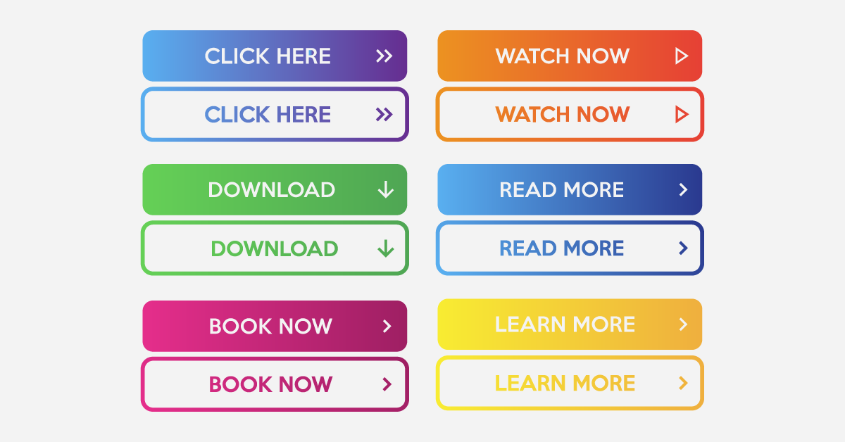
The primary purpose of the CTA, or call-to-action, is to lead the user to navigate their next step, whereas a call-to-value is to explain to the visitor the value of what they are about to do next. It is different than just simply presenting the CTA.
They can learn more about the chiropractor and their professional background by clicking the CTA or call-to-value. Your CTA can come in the form of a button, too.
A simple CTA could say:
- Book an appointment
- Learn more
- Start learning about our services today
- Subscribe to our newsletter
- Get to know more about the chiropractor
You can make it even more enticing by adding “for free’ in your CTA. Ensuring that your call-to-value has the right size and color is important as well. To draw attention to your CTA button, here are a few elements you can emphasize:
- Color – Make sure the color stands out and doesn’t fade into the background of the landing page. Orange, blue, and green tend to work well for buttons.
- Size – What good is your button if a user has to search for it or can’t see it at all? Avoid buttons that are too small and hard to find and buttons that are too big and may scare away users. Find the right balance so that it looks well on the page and is easy to locate.
Learn More About iMatrix Today and Get a Proper Return on Your Investment
Start growing your chiropractic landing page design and copy to find more patients and generate more appointments for your high-revenue services. Talk to us at 888.792.8384 or click here.