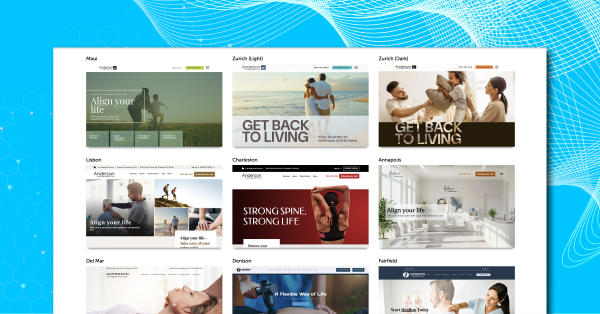
14 Best Chiropractic Website Design Templates for 2026
Your website often forms the first impression potential patients have of your practice. It’s the place where visitors can easily learn about your services, approach to care, and clinic environment. A well-designed chiropractic website also supports patient education, improves search visibility, and helps visitors understand how to schedule an appointment.
Some practices choose website builders or content management systems to create their own sites. While these tools can be accessible, they often require technical expertise, ongoing maintenance, and a clear understanding of page optimization to perform well in search results.
Working with a healthcare-focused marketing partner allows you to build a website that has a greater understanding of your industry. A structured chiropractic website design process focuses on usability, responsive design, and patient trust signals that help prospective patients feel confident contacting your clinic.
Explore the gallery to see chiropractic website designs that demonstrate these principles in practice.
Why Chiropractic Website Design Matters in 2026
A thoughtful chiropractic website design helps guide those visitors toward booking an appointment while supporting chiropractic SEO so your practice can appear more often in local search results.
Strong design also plays a role in building patient confidence. Clear navigation, responsive design across mobile devices, and helpful educational content allow site visitors to quickly understand your services and next steps. Elements such as patient success stories, professional photography, and informative blog posts help reinforce trust while supporting patient education.
For this reason, the designs highlighted here were selected based on usability, consistent branding, responsive design, and conversion elements that help practices create a high-converting chiropractic website while supporting strong local search results and search engine rankings.
Key Features to Include in Your Chiropractic Website
When prospective patients arrive on your site, they should immediately understand who you help, what services you provide, and how to take the next step. The following elements support an optimal user experience while helping healthcare providers strengthen search engine rankings and local search results.
- A clear hero section that explains the conditions you treat and invites visitors to book an appointment or call your clinic
- Consistent branding supported by professional photography of your clinic, staff, and treatment environment
- User-friendly navigation and responsive design so patients using mobile devices can easily explore the site
- Dedicated service page sections for treatments such as back pain, neck pain, sciatica, and sports injury rehabilitation
- Patient trust signals, including reviews, testimonials, and chiropractor biographies, that build patient confidence
- A new patient center with intake forms, first visit guidance, and helpful resources for existing patients
- Informative blog posts and educational content that answer common questions and support chiropractic SEO
- Visible contact details and office hours on every page
- A professional experience that works seamlessly on mobile devices
- Fast page optimization that supports organic traffic and smooth site performance
14 Best Chiropractic Website Design Templates for 2026
1. Denison – Put the Spotlight on Client Reviews
Client testimonials and reviews are the modern equivalent of word-of-mouth marketing. You should put them front and center of your chiropractic website. Denison Design features a section that showcases multiple client reviews. This section shows potential new patients how trustworthy your practice is and helps strengthen your online reputation.
This website design also features an FAQ section designed to answer frequently asked questions from visitors about your chiropractic services. This section educates people on the basics they need to know about your practice.
Moreover, this design features essential information about your practice, like your address and office hours. It’s a simple yet practical website design that can invite more people to your practice.
2. Fairfield – Maximize White Space
It takes more than stellar graphics to make an excellent chiropractic website. You need to utilize white space strategically as well. Why is this essential? You wouldn’t want to overwhelm your visitors’ senses, and it gives your website a nice balance.
Fairfield Design features a clean and balanced color palette that exudes professionalism. From the get-go, this design invites website visitors to book an appointment with your practice.
This design also highlights what your practice does best, so new patients would know what you can do for them. It also features a patient portal for the convenience of your current patients. Overall, it’s a simple and visually appealing website design that is pleasing to the eye.
CLICK HERE FOR FAIRFIELD DESIGN
3. Acadia – A Family-Oriented Website Design
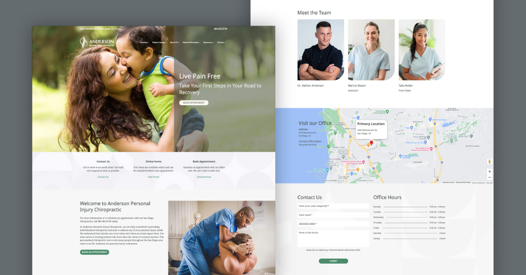
As a chiropractor, your services can have a meaningful impact on your patients’ lives. It is a great idea to draw on the inspiration of family during a patient’s road to recovery on your chiropractic website. Acadia is certainly one of the best chiropractic websites that does just that.
Chiropractors heal patients and better their lives every day with a variety of therapeutic services, so make sure your website conveys that. This design features an adorable image of a mother and her child with the powerful words, “Take Your First Steps On The Road To Recovery.” This powerful message adds a personal touch, demonstrating how much you care about your patients.
Not to mention, this site has great space to feature an amazing bio on your business. Maybe your chiropractic clinic is the oldest in your neighborhood, or you are a chiropractor from another country who opened a practice. Whatever the story, if you want to share it, this design leaves you with plenty of space to do so effectively.
If your chiropractic website has a stellar blog section, highlight this in your website design as part of your SEO strategy.
4. Sierra – Inspire Patients to Live Pain-Free Lives
Patients can feel empowered after receiving their chiropractic treatment. So, play off this by incorporating a delightful image of a patient enjoying outdoor activities. Sierra’s personal injury design is inspiring and adventurous.
While most chiropractic websites incorporate shades of blue, Sierra uses rich red colors instead. Blue is often associated with the healthcare and medical industries. Red, in contrast, has warmth and is more commonly used within the food industry.
However, here, the use of the color red is complemented appropriately by the image of a woman happily kayaking in the fall season. This design will stand out and send a positive message to online audiences. Consider giving this new website a try to encourage healthy habits in your community.
Remember, your website should have a good amount of regular traffic, indicating it is attracting new clients. It should also provide current and potential patients with the clear information they are searching for about your chiropractic practice. A practical yet stylish design featuring valuable chiropractic content, simple navigation, and high-quality imagery are all important elements to keep in mind.
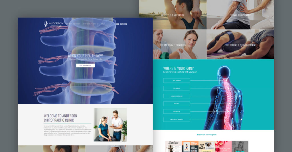
5. Carmel – Elevate Your Website With a Fitness-Oriented Aesthetic
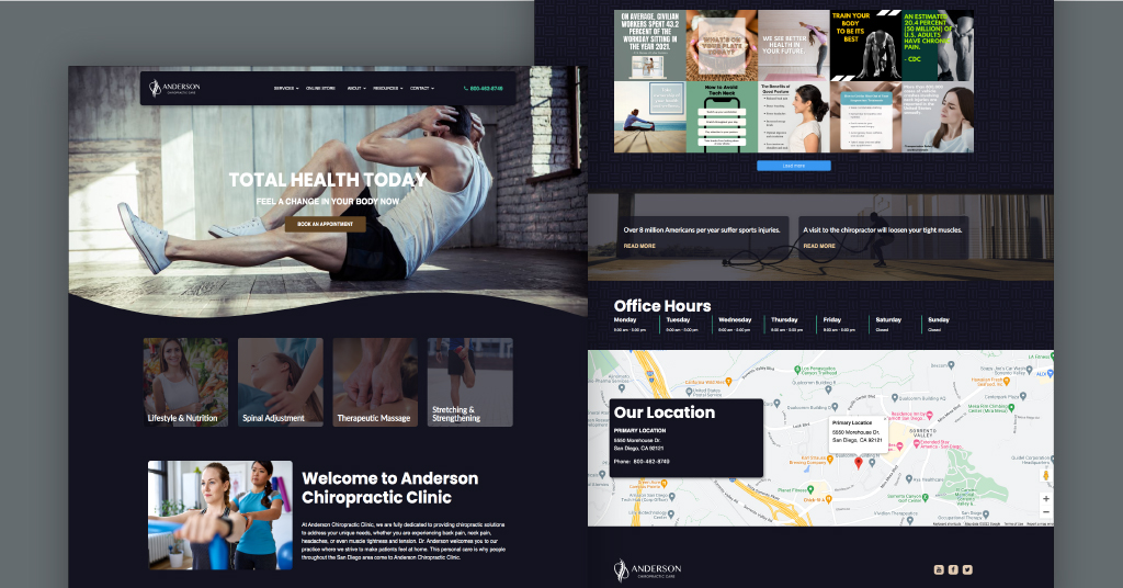
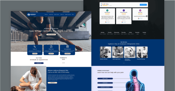
The best chiropractic websites entice potential patients to schedule an appointment right away. The call-to-action (CTA) should be visible upon first glance on your homepage, just like in this design called Carmel.
Think about who your chiropractic practice currently attracts the most—for example, prospects who are injured due to a labor-intensive job or physical activity. If you have a lot of athletes visiting your practice, this is the perfect design for you.
This design includes several images of fitness and exercise to appeal to physically active patients. It has a modern look and theme. The interesting wow factor here is the way the navigation bar floats on the homepage.
In this design, visitors can see a menu with more images on other pages when they scroll down on the homepage. There is also a section for lifestyle and nutrition, spinal adjustments, and therapeutic massage. These pages include content on your chiropractic website that improves search engine optimization.
Why is it so important to include a Google map on your website? Google Maps immediately helps potential clients determine how close they are to your chiropractic office. Location is key, so if you are in a great spot in your area, draw some attention by including this feature on your website.
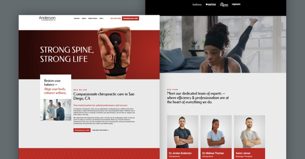
6. Lisbon – Build Trust With a Warm, Care-Centered Layout
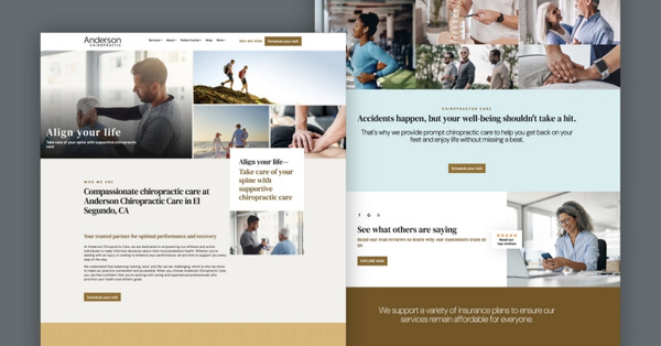
Creating a chiropractic website that feels welcoming can influence how prospective patients respond when searching for a new provider. The Lisbon design illustrates how a care-focused approach can help healthcare providers connect with site visitors while supporting patient confidence and trust.
From the opening section, family-oriented images show people enjoying outdoor activities or receiving chiropractic care. These visuals communicate that your practice supports an active and balanced lifestyle. When paired with the headline “Align Your Life,” the message introduces a supportive tone that encourages prospective patients to explore the site further.
As visitors continue through the website, the calm color palette and clean layout contribute to an optimal user experience. The “Who We Are” section highlights athletes and active individuals while explaining how chiropractic care supports recovery and performance. Including practitioner biographies also adds transparency and helps existing patients and new visitors feel more comfortable before scheduling care.
The Lisbon design also presents a clear list of services that may include spinal adjustments, therapeutic massage, nutritional guidance, and other wellness-focused treatments. Dedicated service page content improves patient education and supports chiropractic SEO by aligning information with relevant keywords used in search results.
Trust signals continue throughout the website. Professional photography, patient testimonials, and video marketing elements provide patient success stories that strengthen credibility and reinforce a positive online reputation.
The design also prioritizes usability. A simple appointment request form, clear office hours, and accurate location details connected to Google Maps help patients take the next step easily. These elements improve local search results visibility while ensuring prospective patients can quickly connect with your clinic.
7. Aspen – Attract More Visitors With a Pop of Color
Ensuring you have a high-performing chiropractic website is possibly the most important component of your online marketing efforts. So, what other factors do you want to consider for your website design? Take a look at the chiropractic website’s color scheme.
You can attract more patients with a homepage that has a captivating color scheme like the one on Aspen’s design. This design uses different shades of yellow to get visitors’ attention right away. By adding a pop of color to your website, you not only stand out against other local competitors, but your website has a fresh and inviting look and feel.
It’s important to note that the call-to-action (CTA) button is very visible. In this example, it says “Explore Our Services.” This copy is also inviting and flows well with the overall design. This is a great example of a color scheme that draws the eyes to where they should go and converts visitors into patients.
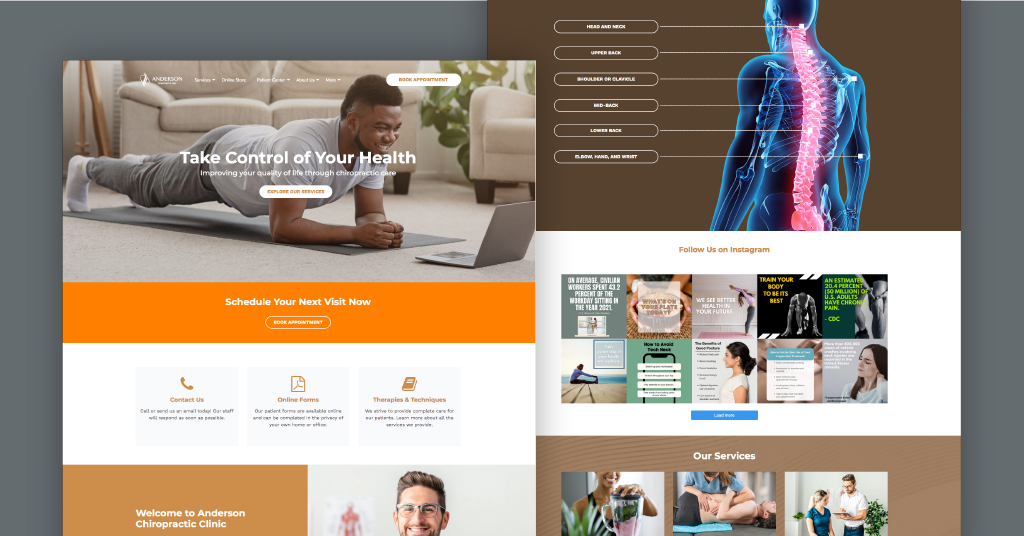
8. Brooklyn – High-Quality, Image-Focused Design
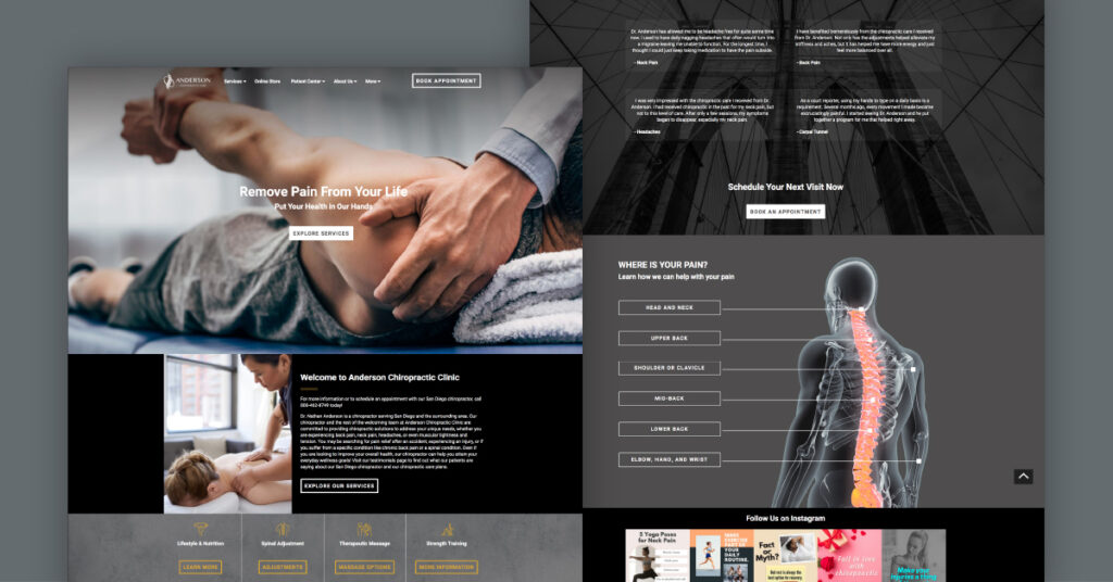
It may be cliché, but an image is truly worth a thousand words. Brooklyn’s homepage immediately captures the attention of the website visitor. In this design, the photos display a patient receiving an adjustment, which is the most popular service for a chiropractor.
You want your website to have images that display what a chiropractic treatment would look like. After all, chiropractors relieve their patients’ pain.
The image on the right attracts new patients with its dimensional infographics of the spine. Images tell the story of what chiro treatments would look like for new patients who have never had an appointment before. They help your practice inform and engage more patients successfully.
Make it easy for visitors to understand the type of health services that your practice offers. With an ‘explore services’ button directly in the center, you are bound to get more users inquiring about your services. This allows visitors to easily view your services (adjustments, massage therapy, personal, sports, accident injury, etc.) with just one click.
Get a chiropractor website with content blocks full of important chiropractic information and images that wow patients at first glance. Custom websites that are tailored to a practice’s needs are our specialty.
9. Harrisburg – Feature A Vivid, Three-Dimensional Video
Sometimes, the best chiropractic websites are the most unique. To do that, try incorporating videos into your chiropractic website. In the Harrisburg website design, an innovative, dimensional video displays a spinal graphic front and center on the homepage. This design feature pops and gives your website a fresh and modern feel.
Firstly, users are more likely to be engaged on your clinic’s website and take action by scheduling an appointment. Remember, videos are an excellent way to encourage visitors to stay on your chiropractic website longer.
According to HubSpot, the number of online videos people watch has doubled in the past few years. Marketers see a positive return on investment, as this encourages growth in leads and sales as well as audience understanding.
In a nutshell, video integration is a fantastic tool for increasing conversions. As users enter your site, they are fascinated by the video. Then, when they continue to scroll, they’ll learn more about your chiro clinic and see what treatments you offer.
A wow factor in this particular website design is the interactive spine simulator. Prospective chiropractic patients can use the simulator to learn about chiropractic treatments. Plus, videos are an excellent way to keep website visitors on your chiropractic websites for as long as possible.
SEE HARRISBURG DESIGN (VIDEO VERSION)
10. Harrisburg – Display Online Booking Forms Front and Center
Booking more appointments is a goal of online marketing strategies. A good website will entice potential patients to get straight to scheduling an appointment and filling out online forms. Harrisburg Design does just that. All online forms are clear and straightforward.
This design also allows visitors to quickly access important forms that can be filled out before their appointment. Instant access to information is important for today’s users, and this template is perfect for providing them with just that. Having a high-performing website is one main component of online marketing efforts.
This chiropractor’s website is spacious, leaving plenty of space to describe your most profitable treatments. So prospects can understand all of your specialties and exactly what types of conditions you can best treat.
SEE MORE OF HARRISBURG DESIGN HERE
11. Kenai – Showcase How Chiropractor Care is For Everyone
Some people might be under the impression that chiropractic treatments are only for athletes or injured people. You can entice new patients to try your services and establish your place in the chiropractic industry by using a website design highlighting that chiropractic care is for everyone.
Kenai Design showcases the practicality of getting chiropractic treatments and, as an online marketing solution, highlights the services you offer. Its simple layout makes it easy for potential clients to send inquiries on treatments and the like.
Another feature that makes this chiropractor’s website design special is how it highlights your experience in the industry. It showcases how many patients you’ve attended to and how long you’ve been helping people with their issues.
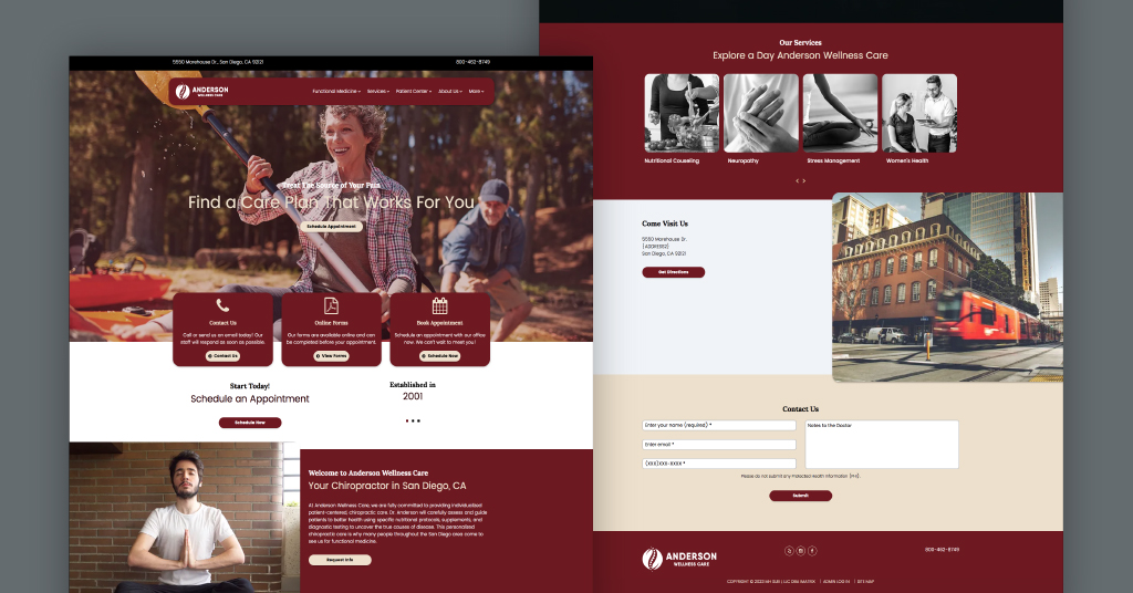
12. Albany – Highlight Yoga and a Healthy Lifestyle
Does your chiropractic office primarily focus on improving your patients’ overall health and wellness through services like massage or functional medicine? This design inspiration for Albany is to promote a healthy lifestyle for patients.
The homepage includes a peaceful image of women in a yoga class that can resonate with potential patients. Incorporating images of physical exercises that can help a patient’s spine or other injuries is generally a great idea. Other pages contain menu items about optimal health services like nutrition, stress management, and women’s health.
This design also uses a fun mix of colors, incorporating traditional blue shades seen in most health-related services websites and logos, and a fun coral color. This vibrant coral color is very unique and gives the design a youthful and feminine touch.
The social media feature lets users know you are active on popular social platforms like Facebook, Instagram, Twitter, and YouTube. By highlighting your social media, you show patients that you’re interested in interacting with your followers. These digital marketing efforts improve your online presence and attract more new patients.
This simple and refreshing design also features a review widget where users will see your Google rating and what patients say about you.
73% of consumers say they always or regularly read online reviews when researching a business.
“Social Pilot”
Positive reviews are now essential for decision-making. People want to hear about the experiences of others before they decide to go into a local business. More positive reviews equal more leads.
13. Charleston – Energize With a Bold, Athletic Theme
If your chiropractic practice focuses on serving athletes and active patients, a bold, high-energy website design can set you apart instantly.
Beyond the visuals, Charleston features clear service blocks covering lifestyle advice, spinal adjustments, and stretching guidance. This intuitive navigation helps website visitors find exactly what they need without hunting through endless menu items. By showcasing these services clearly, your chiropractic website keeps visitors engaged longer and boosts the chance of converting them into new patients.
The bold color scheme works hand in hand with strong calls to action, like “Schedule Your Visit.” These elements encourage immediate booking, which is crucial for busy athletes or active patients who value quick, decisive steps. A high-converting website design like this one helps turn potential clients into loyal patients faster.
To build trust, Charleston highlights real team photos and genuine patient reviews right on the page. This personal touch reassures visitors that your chiropractic services are not just professional but also caring and reliable. When people see real stories and positive feedback, they’re more likely to schedule appointments and recommend your practice to others.
Another important element is the inclusion of a clear FAQ section on the same page. Addressing common questions directly helps reduce hesitation and improves lead quality by ensuring website visitors feel fully informed.
Whether they’re wondering about chiropractic treatment options, insurance coverage, or how soon they can expect results, your website becomes a complete resource.
Charleston’s athletic theme combines a strong online presence, visually appealing design features, and a positive message that resonates with those who want to stay active and healthy.
CLICK HERE FOR CHARLESTON DESIGN
14. Del Mar Multilocation – Connect Multiple Clinics With One Easy Layout
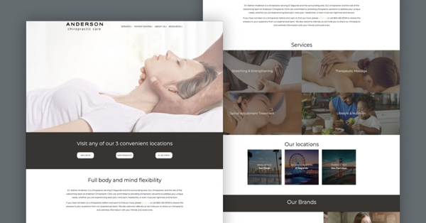
For chiropractic practices with more than one office, a cohesive multilocation website is a smart way to bring all your branches together under one professional website. The Del Mar Multilocation design does this beautifully by dedicating clear, individual sections to each clinic location.
This makes it easy for current and potential patients to find the most convenient branch and feel confident knowing they will receive consistent, quality chiropractic care wherever they go.
The large hero image paired with soothing, spa-like visuals immediately sets a calming tone. These design features help patients see chiropractic treatment not just as medical care but as a relaxing, restorative experience. When someone visits your chiropractic website and sees gentle, inviting images, it encourages them to explore more and view your practice as a place for healing and renewal.
To improve local SEO and make scheduling easy, Del Mar includes a clear map and simple booking form right on the page. This user-friendly design allows website visitors to find the closest clinic in seconds and book an appointment without extra steps.
Including practitioner bios and patient testimonials further builds confidence, no matter which location a patient chooses to visit.
Another important element is the website’s ability to boost local rankings for each office. By targeting city-specific keywords and search terms on one unified chiropractic site, you strengthen your internet marketing efforts without having to create separate websites for each location. This approach helps your practice appear more often in search engine results, supporting your goal to reach more patients and grow each branch.
A multilocation website like Del Mar not only simplifies the patient experience but also positions your chiropractic practice as an organized, trustworthy choice for chiropractic care across different areas.
EXPLORE DEL MAR – MULTILOCATION DESIGN NOW
Conversion Optimization Tips for Chiropractic Website Design
A high-converting chiropractic website helps guide site visitors toward meaningful actions such as scheduling an appointment or requesting more information. Conversion-focused design ensures that prospective patients can quickly understand your services and take the next step without confusion. Thoughtful page optimization also supports organic traffic and strengthens your overall digital presence.
- Clear calls to action should appear early on the page so visitors immediately know how to contact your clinic or request care. Additional prompts placed naturally throughout longer pages can encourage engagement as readers move through service information and patient education.
- Trust signals also influence patient confidence. Placing association logos, review widgets, and patient success stories close to action buttons helps reinforce credibility while visitors consider booking an appointment.
- Simple contact forms also play an important role. Limiting the number of required fields reduces friction, which can make follow-up communication easier for healthcare providers and increase the likelihood that prospective patients complete the form.
Let ChiroMatrix Design Your Website With the Look and Feel You Want
A well-designed chiropractic website strengthens your digital presence and helps prospective patients understand your services quickly. The examples above show how thoughtful design, clear messaging, and patient trust signals support engagement and bookings.
ChiroMatrix applies these same principles through a structured chiropractic website design process that focuses on responsive design, patient education, and search visibility.
Call us at 888.792.8384 to book a consultation, request a demo, or explore current website design options to support your practice.
FAQs
Why Is Mobile Responsive Design Important For Chiropractic Websites?
Mobile responsive design is essential because a significant portion of patients search for healthcare services on smartphones. A website that adapts to different screen sizes improves usability, keeps visitors engaged, and reduces bounce rates. Mobile-friendly design also supports stronger search engine visibility since Google prioritizes mobile-optimized websites in search results.
What Features Should a High-Converting Chiropractic Website Include?
A high-converting chiropractic website should clearly communicate the conditions you treat, the services you offer, and how patients can schedule care. Important elements include clear calls to action, online appointment booking, service pages, patient testimonials, and professional photography. These features help build trust and guide visitors toward booking an appointment.
How Does SEO Help Chiropractors Attract Local Patients?
Search engine optimization helps chiropractic websites appear in search results when people look for care in their area. Effective SEO strategies include using localized keywords, maintaining consistent business information across directories, and creating dedicated service pages. Over time, these efforts help practices generate organic traffic and reach nearby patients who are actively seeking treatment.
Do Chiropractic Websites Need Online Appointment Scheduling?
Online appointment scheduling improves usability by allowing patients to book care at any time without needing to call the office. Many people search for healthcare services outside regular office hours, so a 24-hour scheduling option reduces friction in the booking process. This convenience often increases conversion rates and improves the overall patient experience.
Why Are Patient Testimonials Important On A Chiropractic Website?
Patient testimonials provide social proof that helps prospective patients feel more confident when choosing a chiropractor. Authentic experiences can address common concerns about treatment and demonstrate how care has helped others improve their health. Strategically placing testimonials across the website strengthens credibility and encourages visitors to take the next step.
What Ongoing Maintenance Does A Chiropractic Website Require?
Maintaining a chiropractic website involves hosting, software updates, security monitoring, and ongoing SEO improvements. Regular updates ensure that information remains accurate and the website continues to perform well in search results. Consistent maintenance also supports data security, usability, and long-term visibility in local search.