15 Best Ophthalmology Website Designs For 2025
A revenue-driven ophthalmology practice knows how critical it is to have an effective website. The best ophthalmology website designs attract new visitors and provide vital information about eye care. A good site design includes a functional layout, eye-catching colors, and engaging content.
Without these elements, your website will have a difficult time ranking high on search engines like Google, Yelp, Bing, Facebook, and more. While your website may have been excellent when you first opened your practice, times change, and people’s online behaviors change. Nowadays, it’s more challenging to stand out online, but it’s not entirely impossible.
Check out these examples of the best ophthalmology websites for 2025. Visit our gallery here to see the top designs.
1. Seville – Use a Soothing Green Layout to Project Growth
To begin, one of our newest website designs, Seville, uses color psychology effectively. The Seville layout has a simple yet soothing design that shows people when a clinic is available. Green signifies balance and harmony. It gives a calming vibe, so website visitors would associate your practice with their well-being and calmness. It’s okay to keep it simple and show people what kind of eye care services your practice specializes in.
The color palette you choose can impact how people perceive your business. Green is often associated with science, so this color can allude to viewers that your team is full of vision scientists so to speak, or more simply experts in treating common eye diseases.
The online image you portray of your business should highlight specialty or the most profitable services like age-related macular degeneration. Moreover, the website design makes it easy for anyone to contact the clinic. Bonus Tip: First aid eye care blogs or tips for eye care like the differences in eye drops etc. might resonate with readers and attract more clicks to your site.
Explore the Seville design here
2. Denison – Highlight Your Office Location and Operating Hours
While your patients should know that you specialize in diabetic retinopathy or age-related macular degeneration, one of the most vital pieces of information your website design should highlight is where and when you’re available.
A simple yet impactful website design like the Denison layout not only details where the practice is located but also specifies when the clinic is available to service patients. Moreover, this design shows client testimonials, which play a crucial role in inviting people to visit your clinic.
Click here for the Denison theme
3. Fairfield – Put The Spotlight on Your Service Specialty
When potential patients check out ophthalmologist websites, one of the things they’re probably on the lookout for is if your practice can take care of their specific needs. That’s why you should display your specialty on your website design, as seen in this design, Fairfield.
Do you offer glaucoma treatments or other special services? You should spotlight what your clinic does best. For example, maybe your practice has a great reputation for making accurate diagnostics quickly and efficiently for patients with a wide variety of issues. This will encourage patients looking for specific services to book an appointment with you. The Fairfield design has sections highlighting what kind of special services a practice offers.
Does your practice have any association with the American Academy of Ophthalmology? Highlight this if you can somewhere on your homepage to further demonstrate your practice’s professionalism and expertise.
4. Kenai – Capture People’s Attention with a Compelling Video
If you want your website to make a good impression, consider including a compelling video in its design. Videos can leave a lasting impact and enhance user engagement. More website visitors would rather watch a short video instead of reading paragraphs of text. Videos can communicate your message effectively and quickly.
A website design like Kenai features a short but impactful video that can catch your audience’s attention in a few seconds. It also features fast facts about your business at the bottom of the page to highlight what your practice can deliver.
5. Sierra – Use a High-Quality Image on your Homepage
Sierra, a contemporary website design, balances simplicity with more vibrant colors. A mixed-use of burgundy, red, and beige are great colors that most healthcare professionals don’t use as often. This website features a large high-quality image of an eye zoomed in to really captivate any potential patients searching for your specialty services.
Just remember, your website is like your practice’s online business card, so you want to make it count. Don’t be afraid to mix it up every few years to ensure your online presence always looks polished and professional. A bold design like Sierra might be exactly what you need to stand out if you’re an eye-care expert who is unafraid to be different from everyone else.
Click here to view this design.
6. Acadia – Get a Professional Website with a Classic Layout
Are you looking for a new website design? We have plenty of options for you to choose from. Let’s start by introducing the latest design, Acadia. This design has a classic layout with a home page featuring a single stock image and a headline placed on the left side.
For experts in eye care and vision loss, we recommend keeping the design simple and prioritizing the user experience. This ophthalmology website design is sure to make a great first impression. It utilizes a lot of white space, and there are enough breaks between the text, so your audience won’t get bored by too many long paragraphs on your web pages.
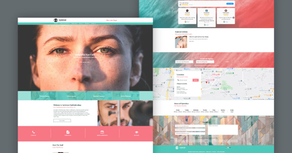
7. Carmel – Get a Simple Yet Bold Website Design
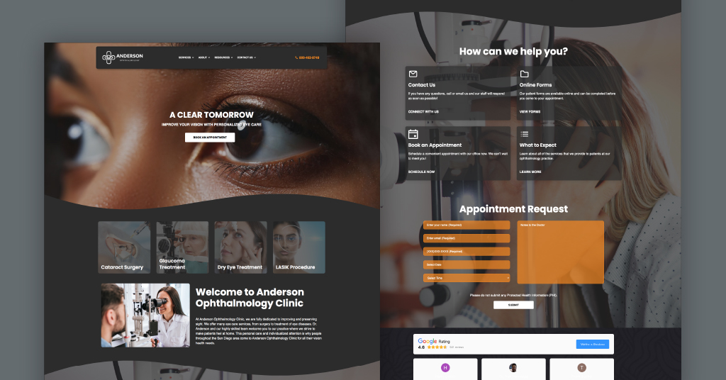
Here, we have a super sleek website design called Carmel. The simplistic homepage covers all the necessities you want to find on your website. When visitors scroll through the website, they will see online reviews and a form request to book their next appointment.
Online reviews are vital to position your clinic as a place people can trust. They give website visitors an idea of what they can expect from a third person’s perspective. These short messages can show that you can walk the talk as an eye care expert.
An important note when picking your design is to look for a visible call-to-action button and complimentary headline. This design has the headline “A Clear Tomorrow,” which will resonate with your incoming patients. Make sure your website supports the right messaging, advocating vision scientists like you. This design is bold with its darker color scheme creating a strong modern look.
8. Brooklyn – Refresh Your Website with a Minimalistic Design
Looking for something a bit more classic? Check out this ophthalmology design, Brooklyn. While the layout is also pretty simple, the muted gray color scheme gives it a more minimalistic vibe. However, the map section also really pops here with the contrast between black and yellow.
What’s great about the Brooklyn design is the interactive map section. It allows you to show website visitors where your practice is located, making it easier for them to find you once they book an appointment.
Sometimes, a cleaner approach works better than louder designs that may overpower a visitor’s eye. Of course, the goal is to book more appointments. However, your website also serves as your practice’s digital footprint, providing tons of important information about your services. Keeping your website very clean is always a great option if you want to maintain an informative online presence.
Check the Brooklyn design here
9. Sedona – Maintain an Organized Layout while Incorporating Features
It’s great to have various elements on your website, like a practice bio, a section for your staff, reviews, etc. Sedona ties all these different sections together seamlessly. Here, we have a design filled with subtle details.
Pictures of your staff add a personal touch and can assist in making your practice stand out from others in your area. Moreover, it gives your audience an idea of who they’d be working with for their clinical diagnosis or cataract surgery.
Opting for icons on the menu instead of photos or text adds a subtle uniqueness to your website. Plus, don’t miss the soothing landscape backgrounds of the desert. These background images have a greyish tint over them to add a lot of dimension and depth to the overall look and feel.
10. Valencia – A Logo and Headline that Leaves a Lasting Impression
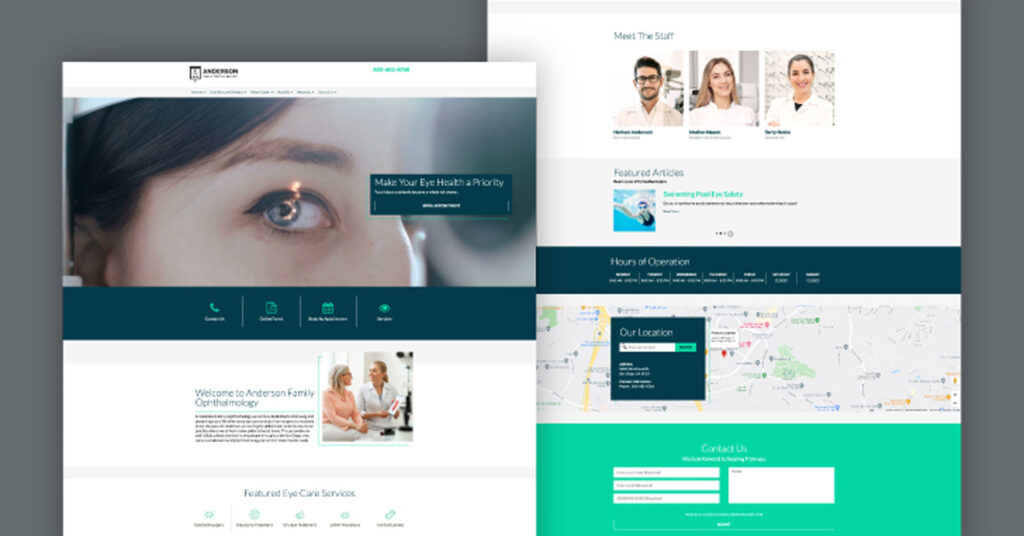
A great logo will entice new patients and create a lasting impression. Display your practice logo with this website design called Valencia.
The headline emphasizes the importance of healthy eye care to the user. “Make Your Eye Health a Priority,” since you want them to visualize themselves in your practice, you should use (you) in your website copy. By doing so, you create a cleaner sentence structure and more approachable content.
Under the headline, users can book an appointment. The headline above the call-to-action (CTA) attracts the user’s attention, which will increase conversions.
11. Aspen – Subtropical and Fun Layout Will Keep Users Coming Back For More
If your practice is located in Hawaii, California, or Florida, this is the perfect website for you. Upon entering the site, the users will see a surfer looking straight ahead. Rather than schedule an appointment, users are prompted to explore services, leading to a “What to Expect” page.
The users will be able to see what specialties are treated at this practice and where the office is located, allowing them to decide whether to visit your practice or not. If your forte is in neuro-ophthalmology or eye surgeries, this design would let your expertise shine.
12. Harrisburg – Build Connections with Website Visitors
The graphic’s vivid colors draw your attention immediately. The layout is simple, with a readable, evenly spaced font, and does not overwhelm visitors. While scrolling through the homepage, users can see photos of the ophthalmology practice, the doctors, and staff members and learn more about their services.
It is important to include these images so that new patients who read and see the photos of your staff will feel more at ease about visiting your practice.
Click here to view the Harrisburg design
13. Albany – Social Media and Review Section to Increase Engagement and Attract More Patients
The pinks and teals make a layout like this feel fresh and clean. The social media feature in the Albany website design shows that your practice is active online and likes to interact with other patients and followers. This will allow you to increase your engagement and potentially grow your following.
The review section will significantly increase conversions and build trust with new patients.
95% of U.S. adults surveyed believe online doctor reviews and ratings are reliable.
Promote your 5-star patient reviews on your ophthalmology website to help new patients feel comfortable visiting your practice and generate more appointments.
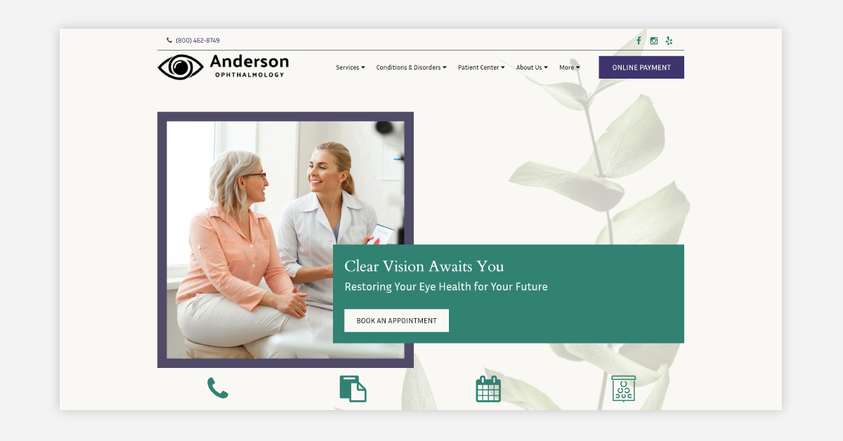
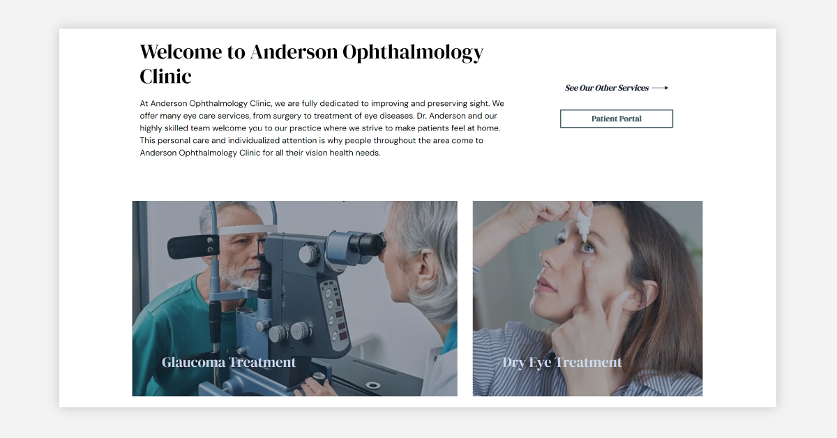
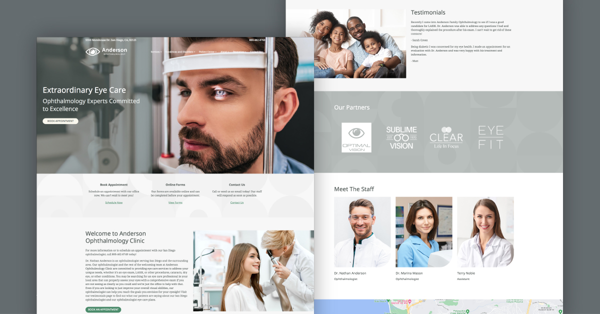
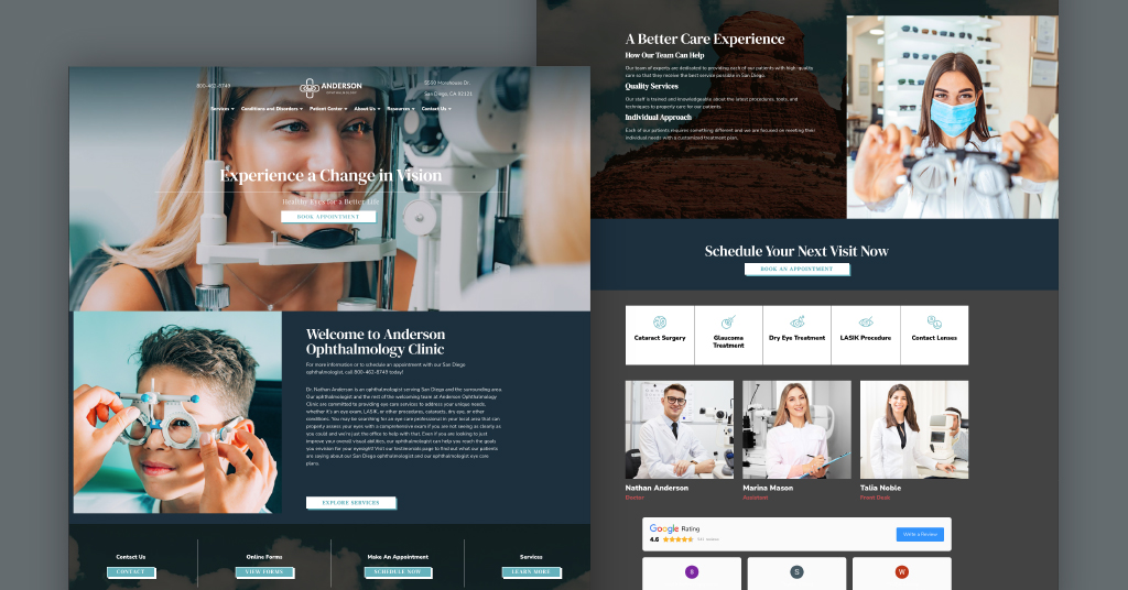
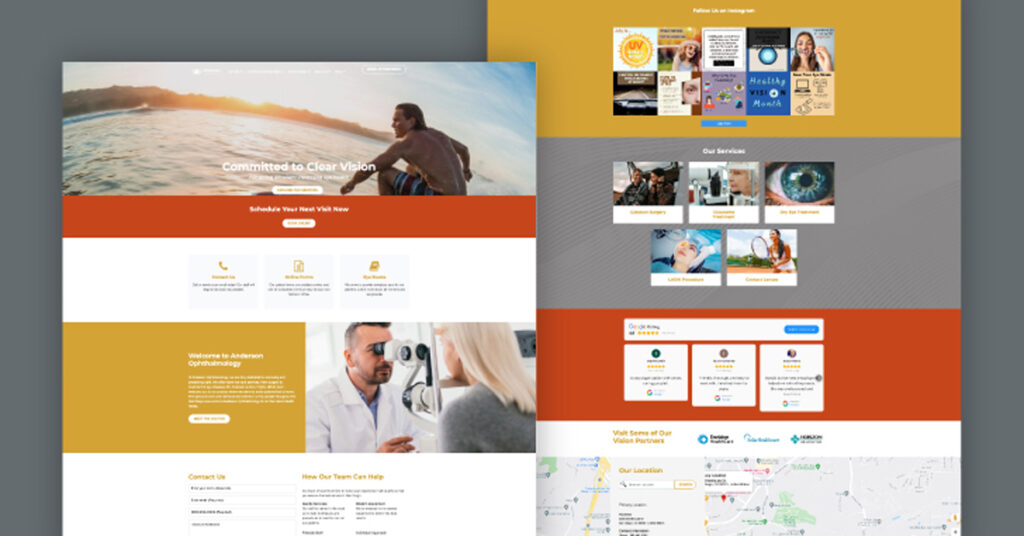
14. Annapolis – Keep It Friendly and Focused with a Patient-First Design

Annapolis blends approachability with professionalism, providing your website with a polished appearance that instantly puts visitors at ease. It opens with a modern, sunlit image featuring a calming reception area and a bold headline that communicates your value. The large “Schedule Your Visit” button is placed prominently in the top-right corner, making it easy for patients to take action from anywhere on the site.
This design flows naturally from your clinic’s story into specific services, with bold blocks outlining treatments like cataract surgery, glaucoma care, LASIK, and dry eye. A dedicated section introduces your doctor with a warm, professional portrait and a clear summary of credentials. Patients can easily explore accepted insurance plans, read real reviews, and browse affiliations from respected medical organizations like the American Academy of Ophthalmology and ASCRS.
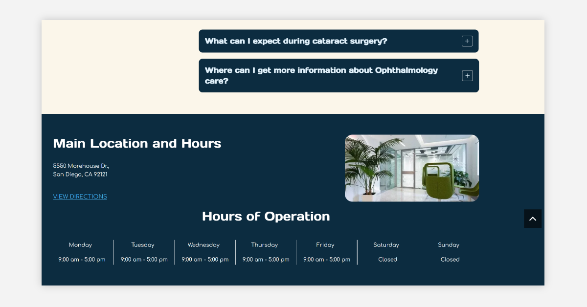
What makes Annapolis stand out is the thoughtful contact section. It includes clinic hours, a patient-friendly message form, and a large embedded map to help visitors plan their visit. From start to finish, this theme balances warmth, structure, and clarity—perfect for practices that want to build credibility while making patient access seamless.
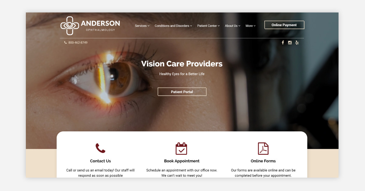
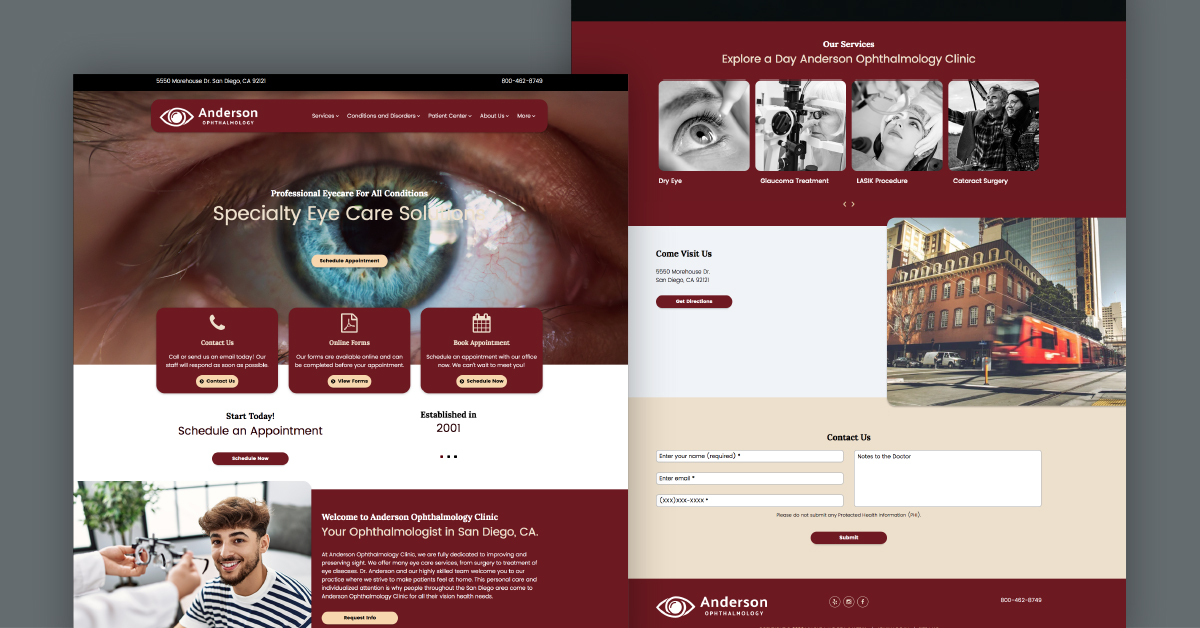
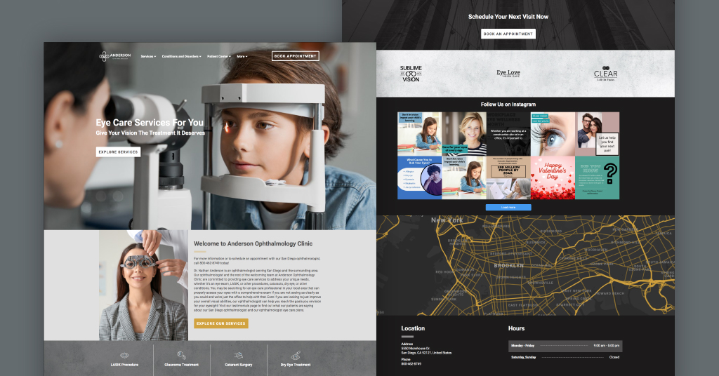
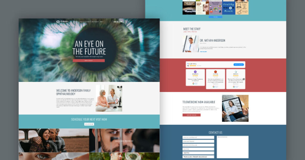
15. Del Mar – Make a Modern Statement with a Crisp, Polished Layout

Del Mar gives your website a sharp, polished look that immediately builds trust with new visitors. The homepage opens with a welcoming image of an ophthalmologist in action—perfect for putting faces to your care and helping potential patients feel at ease from the start. Right above, the top navigation bar keeps things simple. Your contact number and appointment links are clearly visible, which means first-time visitors don’t have to dig around to get in touch.
Scrolling down, this layout showcases your core services—cataract surgery, LASIK, glaucoma care, and dry eye—in bold, high-quality image blocks. These visuals not only guide users through your specialties but also help answer a common question: “Is this the right clinic for my specific condition?”
Further down, real patient reviews and recognizable partner logos create instant credibility. The “Our Staff” section humanizes your practice by introducing team members, making visitors feel like they already know who they’ll meet. And with contact forms and clinic hours placed neatly at the bottom, there’s no confusion about how to follow through.
Altogether, Del Mar is designed to reassure, inform, and convert. It’s the kind of first impression that helps patients feel like they’ve already made the right choice.
Let Us Design A Website That Best Suits Your Ophthalmology Practice
As you take a look and explore the best ophthalmology website designs in 2025, view your current website and see what features you may be missing. Sometimes your website might just need a refresh to help you attract more patients to your practice.
See how you can get a tailored professional website that highlights your services and increases your ranking on Google so you can be found online by more patients. You need a website design that reflects what your clinic stands for and how you want people to perceive you as vision scientists.
Give us a call at 888.792.8384 or click here to receive special pricing on our website services.
FAQs
How do I make my website eye-catching?
Simplicity is the key to making your website eye-catching. Your website design should have a lot of white space, a clear navigation bar, strategic featured information through design, and intentional color choices.
How to make your website appealing to the readers?
To make your website appealing to the readers, develop the best website design that reflects everything your business stands for. Don’t forget to ensure that your content is easy to read. Typography plays an integral role in keeping people interested in one’s website.
How do I grab attention on my website?
There are plenty of ways to get people’s attention through web design. It would be ideal, to be honest about what you’re offering like age-related macular degeneration or specialty eye drops, and what people can expect from your business. You should ensure that the hero section stands out and that your website loads fast, regardless of the device people are using.