SEO Tips for Mobile-Friendly Websites
When you’re craving a particular cuisine, looking for a doctor, or trying to find something to do, how often do you find yourself picking up your smartphone instead of your computer? With the abundance of smartphones available and dropping prices on data plans consumers are using their phones more and more to find immediate results or answers.
In 2012 Kelsey Group predicted that the amount of mobile searches would overtake searches made on desktop computers by 2015. Current evidence suggests that searches made on mobile devices account for approximately 40% of website traffic and this number continues to climb.

Build a Mobile Optimized Website
Websites designed for PC are not built to perform well on devices with limited computing power, therefore search engines will prioritize mobile-optimized websites ahead of others that may be difficult to load on mobile devices.
Google supports three different configurations for creating smartphone-optimized websites, but they have openly recommended using responsive website design. When building a responsive layout, the same HTML is used for all website content but CSS media queries determine where and how the content is shown on different devices and browser dimensions.
It is not recommended to build a mobile app in most cases. Mobile apps cannot be crawled/indexed by search engines and will not come up in search results.

Develop Top Funnel Content
Compelling content is the heart of a mobile-optimized website and it is important to always include the most useful content near the top of the page for better visibility on mobile devices. When creating content for mobile SEO it is important to include:
• Content promoting the goods and services your business offers.
• Detailed information discussing products and/or services
• Advice articles or blogs – these help pull in mobile users looking for solutions
• Regularly updated new client specials and offers to drive conversions
Be Aware of Page Speed and Eliminate Pop-ups
According to Google’s mobile optimization guidelines, the key content on a webpage should be delivered to mobile website visitors within one second or less. It is important to take steps towards quick page load time as websites may be penalized for slow load times in the future.
If you have ever visited a website on your smartphone where pop-ups appear, then you know how annoying these can be due to the screen size. It is best to avoid using pop-ups in almost all cases. Provide information such as newsletter sign-ups and calls-to-action elsewhere in an easy to find location.
Optimize for Local Users
Research (Ipsos and Google, May 2013) found that 94 percent of mobile users conducted searches for local information and 84 percent took action as a result.
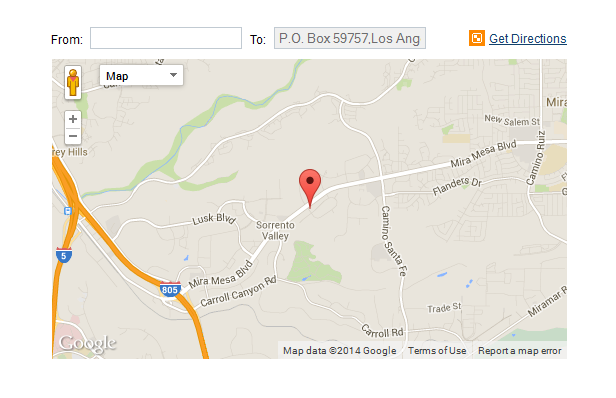
If you have multiple locations, provide mobile-friendly optimized pages targeting each location. Including a link to Google Maps for easily accessible directions can help increase the likelihood that visitors will convert.
Make Contact Information Easily Accessible
The highest bounce rate from website visits comes from mobile users. It is crucial to provide easy-to-find contact information for those visitors planning to take immediate action. Plan your placement of phone numbers, directions, and business hours accordingly.
If you have any questions about mobile optimization or would like more information regarding SEO best practices, call us at 1-800-IMATRIX.