How to Improve Website User Experience: 15 Ways to Turn Visitors Into Patients
A patient hears about your practice from a friend, searches your name, and taps your website. Within a few seconds, they decide whether you look like the right fit or whether the clinic down the street looks easier to book. That snap judgment rarely comes down to your credentials. It comes down to how your website feels to use, and you can improve website user experience faster than most practice owners expect.
TL;DR: To improve website user experience, start by learning who your patients are. Then fix the basics: clear navigation, fast page load times, mobile optimization, and contact details people can reach in one tap. Layer in consistent design, accessibility, and trust signals. Finally, run usability testing and review your data on a schedule so the improvements keep coming.
What Is Website User Experience?
Website user experience (UX) describes how easy, fast, and pleasant it feels for someone to use your website to get what they came for. For a practice, that usually means finding a service, checking hours, or booking a visit without hunting for it.
UX design covers far more than the look of a page. It shapes the structure, navigation, speed, content, and forms that guide visitors toward an action. A gorgeous homepage that hides the phone number still delivers a poor experience.
Five factors drive most of it:
- Structure: how you organize pages and information
- Navigation: how visitors move from one page to the next
- Performance: how quickly pages load and respond
- Design: layout, typography, color, and imagery
- Content: what you say and how clearly you say it
Why User Experience Plays a Crucial Role for Your Practice
Word of mouth still sends patients your way. What changed is the step that comes next: almost every referral now checks your website before picking up the phone. Your site either confirms the recommendation or quietly undermines it.
A strong user experience plays a crucial role in three places. It builds credibility, because an organized, modern site suggests an organized, modern practice. It lifts conversion, because fewer obstacles mean more calls and appointment requests. And it supports search visibility, since Google rewards pages that load quickly and work well on phones.
The reverse holds too. Pages that look dated, load slowly, or bury key details send people to a competitor before they ever speak with your front desk.

Signs It’s Time to Improve Your Website
Not sure whether your site needs work? Run through this checklist. If three or more items sound familiar, your website probably costs you appointments every month.
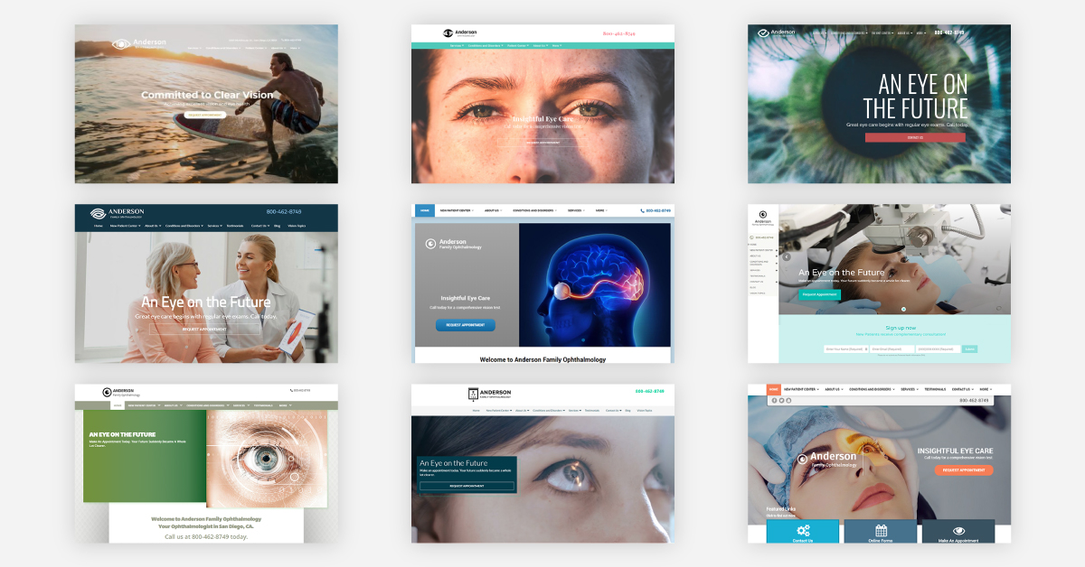
- The design hasn’t changed in years and no longer matches your office or brand
- Pages load slowly, especially on a phone
- Visitors have to search for your phone number, hours, or booking option
- Staff bios, services, or hours show outdated information
- Links lead to error pages, or images fail to load
- Pages feel cluttered with too many fonts, colors, and competing buttons
- Your analytics show quick exits and few form submissions or calls
Each warning sign above points to a specific way to improve website performance, and the next section covers all of them.
How to Improve Website User Experience: 15 Practical Ways
These tactics move roughly from planning to design to upkeep. You don’t need to tackle all 15 at once. Pick the two or three that address your biggest gaps and start there.
1. Understand Who Your Patients Are
Every good UX decision starts with research into the people you serve. Before you change a single button, understand your target audience: their age, location, the devices they use, and the questions they bring to your site.
Your front desk holds a goldmine of insight here. Ask staff which questions callers repeat most often. Those questions reveal the content your website should answer up front.
Audience details shape design choices. A chiropractic office that sees many older patients should use larger fonts and high contrast text. A veterinary clinic with younger pet owners might put online booking and the client portal front and center.

2. Build Clear Navigation
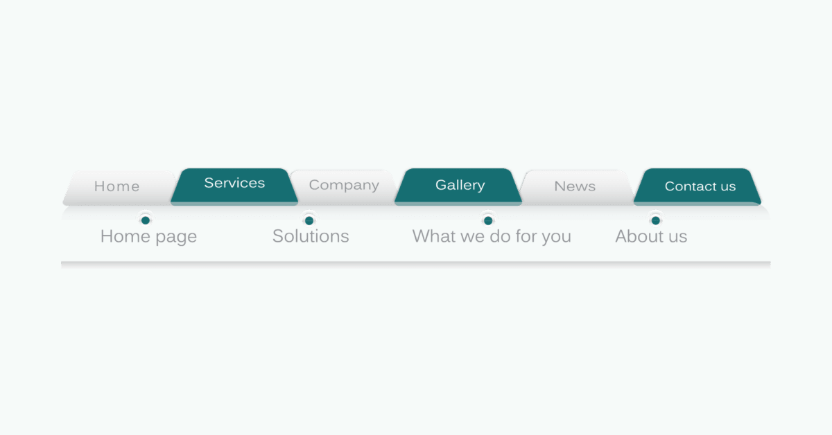
Visitors should never wonder where to click next. Build clear navigation with a simple top menu and familiar labels like Services, About, Patient Resources, and Contact. Most users expect the menu at the top of the page and expect your logo to take them back to the homepage.
Keep the main menu short. Group individual services under one dropdown instead of lining them all up across the header. A tidy footer that repeats your key links gives lost visitors a second route home.
3. Make a Strong First Impression on Your Homepage
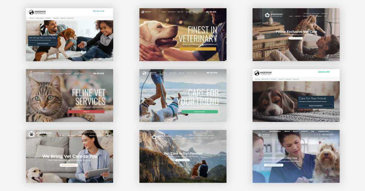
Think of your homepage as the front door of your office. In a single glance, it should tell visitors who you are, what you do, and why they should choose you.
Place a short value statement and one primary button, such as “Book an Appointment,” above the fold. Resist the urge to cram every service onto this page. Short sections with descriptive subheadings let people scan quickly and click through to the details they want.
4. Speed Up Page Load Times
Slow page load times cost you patients. Visitors expect a site to load in a couple of seconds, and many leave when it drags. Speed also feeds into how Google evaluates page experience.
Google measures performance through its Core Web Vitals. In plain terms:
- Largest Contentful Paint (LCP): how fast your main content appears. Google rates 2.5 seconds or less as good.
- Interaction to Next Paint (INP): how quickly the page responds when someone taps or clicks
- Cumulative Layout Shift (CLS): how much the content jumps around while it loads
Most practices can win back speed with a few fixes. Compress and resize images, remove plugins you no longer use, drop auto playing videos and pop ups, turn on caching, and choose reliable hosting. Ask your developer to trim unused code and scripts as well. Then run Google PageSpeed Insights once with all your plugins active and again with them switched off. The difference tells you exactly what slows your site down.
5. Design for Mobile First
Phones now dominate how people browse. Mobile devices accounted for about 62.7% of global website traffic in the second quarter of 2025, according to StatCounter data published by Statista.
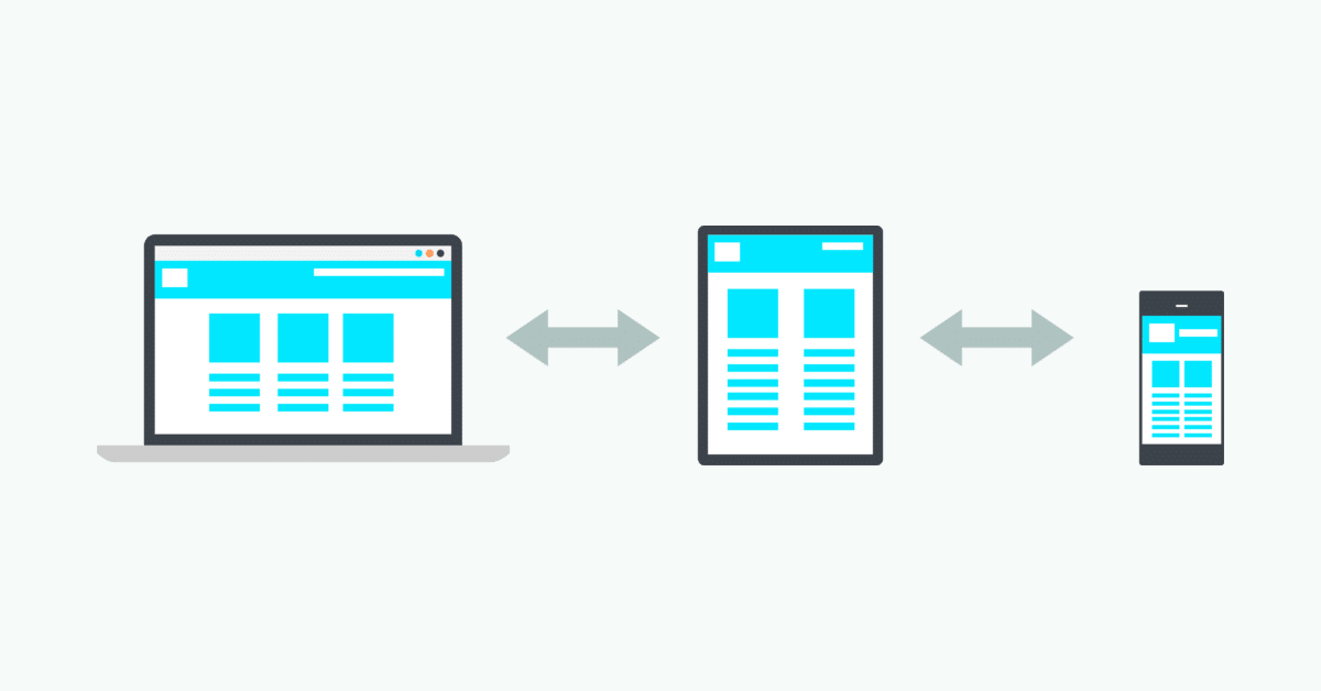
Mobile optimization means more than a site that shrinks to fit a small screen. Use responsive design so layouts adapt to any device, make buttons large enough for a thumb, and leave breathing room between links. Turn your phone number into a tap to call link and your address into a map link.
Always check your site on real phones rather than a resized desktop browser. A layout that looks fine on a monitor can feel cramped and fiddly in someone’s hand.
6. Consistency Is Key Across Every Page
Here’s a principle that top performing sites share: consistency is key. When fonts, colors, buttons, and layouts stay uniform from page to page, visitors stop relearning your site and focus on your message instead.
Brand consistency reaches beyond your website too. Use the same logo, colors, and voice on your office signage, your site, and your social profiles. If you run Facebook or Instagram pages for your practice, our social media marketing team can keep them aligned with your website. Over time, that repetition builds real recognition in your community.
7. Make Your Content Easy to Scan
Most visitors scan before they read. Help them out by writing helpful content in short paragraphs, adding descriptive headings, and turning lists of services or benefits into bullet points.
Write around the questions patients actually ask. What happens at a first visit? Do you accept my insurance? How long does a physical therapy session last? Mix in short videos and FAQ sections for people who prefer to watch or skim.
8. Use Original, High Quality Images
People spot stock photos fast, and generic images make one practice look just like the next. Photos of your real team, office, and patients (or their pets, for a veterinary clinic) build a personal connection before anyone walks through your door.
Good images also break up long blocks of text and hold attention. For more ideas, read our guide on how a picture really is worth a thousand words in your marketing. Before you upload anything, compress the file and add descriptive alt text. Both steps help speed and accessibility at once.

9. Use White Space to Reduce Clutter
White space gives your content room to breathe. It makes text easier to read and pulls the eye toward the elements that matter most, like your booking button.
Clutter usually creeps in through too many links, fonts, colors, and images fighting for attention on one page. Strip each page back to what visitors need. Then balance the important information above the fold with enough space around it to help it stand out.
10. Write Clear Calls to Action
A call to action (CTA) tells visitors exactly what to do next. Start every one with a verb: “Book Your Visit,” “Call Our Office,” or “Request an Appointment.”
Give CTA buttons a color that contrasts with the rest of the page, and put them where people expect to find them: in the header, after key sections, and at the bottom of each page. Stick to one primary CTA per page so visitors never have to choose between competing actions.

11. Keep Contact Information Easy to Find
Your phone number, address, and hours should take one glance to find. Put them in the header or footer of every page and on a dedicated Contact page with an embedded map.
Keep your name, address, and phone number (NAP) identical across your website, Google Business Profile, and online directories. Mismatched details confuse patients and search engines alike.
12. Build Trust With Reviews and Credibility Signals
Patients want reassurance before they book. Give it to them with testimonials, review widgets, and team bios that list credentials and certifications. A short story about why you founded your practice adds a human touch.
Every positive customer review on your site does quiet persuasion work for you. A secure HTTPS connection adds another layer of confidence, especially on pages with forms. Together, these signals help visitors choose you over the practice down the street.
13. Improve Website Accessibility for Every Patient
Website accessibility means people with visual, hearing, motor, or cognitive limitations can still use your site with ease. For a healthcare practice, those users include many of your own patients.
The Web Content Accessibility Guidelines (WCAG) set the standard. Start with these basics:
- Add alt text to every meaningful image
- Use strong color contrast between text and background
- Keep font sizes comfortable to read
- Let people move through menus and forms with a keyboard alone
- Label every form field clearly
- Add captions to videos
Accessibility work tends to make your site easier for everyone, not only for people with disabilities.
14. Remove Friction From Forms and Online Booking
Every extra form field gives someone another reason to quit. Ask only for what you need to schedule a visit, and show friendly, specific error messages when something goes wrong.
Offer online booking or an appointment request form so patients can reach you after hours. Use secure forms whenever you collect patient details. Keep pop ups away from booking pages, where interruptions do the most damage.
15. Find and Fix Broken Links and 404 Errors
Few things frustrate visitors faster than a link that goes nowhere. Each broken link interrupts the patient journey and chips away at trust.
Check Google Search Console for crawl errors, or run a site crawler to catch broken links in bulk. Then create a custom 404 page that apologizes briefly and points visitors back to your homepage, services, and contact page.
Testing and Measuring Your Website’s User Experience
How do you know your changes actually worked? You test them. Testing turns guesses into evidence and shows you which improvements move patients toward booking.
Run Usability Testing
Usability testing simply means watching real people use your website. Ask three to five people, such as patients, friends, or staff members, to complete a few tasks: find your hours, locate a specific service, and request an appointment. Have them try each task on a phone and on a desktop.
Watch where they hesitate, scroll back, or get stuck. You’ll usually spot your biggest usability problems within the first few sessions, so fix those first.
Track UX Data in GA4 and Search Console
Your analytics data shows how visitors behave at scale. In Google Analytics 4, keep an eye on:
- Engagement rate: the share of sessions where visitors actually interact with your pages
- Average engagement time: how long people stay active on your site
- Conversions: calls, form submissions, and booking requests
- Device breakdown: whether mobile visitors convert as well as desktop visitors
Google Search Console adds Core Web Vitals and mobile usability reports. Heatmap tools like Hotjar or Microsoft Clarity show where people click, how far they scroll, and where they drop off.
Ask Patients for Feedback
Your patients and their families use your website more than you do. Add one website question to your after visit surveys, read your reviews for comments about booking, and note any confusion callers mention to your front desk. Keep a running list of these fixes and work through it each quarter.
Keep Your Website Fresh With a Simple Maintenance Schedule
A great user experience won’t stay great on its own. Hours change, staff come and go, and plugins age. A simple routine keeps small problems from turning into big ones.
| How often | What to check |
| Monthly | View your site on desktop and mobile; confirm hours, staff, and services; test forms and key links |
| Every 6 months | Review design, content, page speed, and analytics; plan your next updates |
| Every few years | Consider a full redesign if several of the warning signs above still apply |
Put these checks on a recurring calendar reminder so they actually happen.
How a User Friendly Website Turns Clicks Into Appointments
Every tactic in this guide serves one goal: making the path from “I found you” to “I booked” feel effortless. A user-friendly website doesn’t need flashy features. It needs speed, clear navigation, easy contact, and pages that look like the practice patients will meet in person.
When you prioritise the details patients notice first, you give them the best experience before they ever step into your office. Start with the biggest gap on your checklist, measure the result, and move to the next one. Small, steady changes add up to more calls and fuller schedules. For vertical specific ideas, our optometry website design tips show these principles in action.
If you’d rather hand the work to a team that builds websites for chiropractic, veterinary, optometry, and physical therapy practices every day, iMatrix can help you improve website user experience from the ground up. Request a free website audit or call us at 800.792.8384 to see where your site stands.
FAQs
What is the user experience of a website?
Website user experience covers every part of how someone interacts with your site, from layout and visual design to navigation, speed, and forms. A good experience lets visitors find information and complete tasks, such as booking an appointment, quickly and without frustration.
What makes a great website user experience?
A great website feels easy to use. It loads quickly, works smoothly on phones, offers intuitive navigation, and organizes content so visitors find what they need right away. Clean, consistent design and clear calls to action round it out.
How can I improve my website user experience?
Start with the fixes that affect the most visitors: faster page speed, a mobile friendly layout, simple navigation, and contact details on every page. Then add accessibility features, trust signals like reviews, and shorter forms. Test your changes with real users and track the results in your analytics.
How do you build a good user experience?
Build it around your audience. Research what your patients need, design pages that answer those needs clearly, and keep the look and feel consistent across your site. Then run usability tests, collect feedback, and refine based on what you learn.
How often should I update my website?
Check your site monthly for outdated information and broken links, and review design, content, and performance every six months. Plan a full redesign every few years, or sooner if your site looks dated or struggles on mobile.