Ophthalmology Website Design: Examples and a Practical Guide for 2026
Your ophthalmology clinic does excellent work. Patients trust your hands in the operating room.
Then someone searches for an eye doctor at 10 pm on their phone, lands on your site, waits four seconds for it to load, cannot find your hours, and books with the practice down the road.
Good ophthalmology website design fixes that gap. It informs patients, earns their trust, and turns a visit into a booked appointment before a competitor gets the chance.
TL;DR: Strong ophthalmology website design does three jobs: it explains your services clearly, it builds trust fast, and it makes booking easy on any device. This guide shows design examples worth exploring, the features every eye care site needs, and what a build actually costs and takes. It is written for practice owners and office managers who want more patients, not a design lecture.
What Makes a Good Ophthalmology Website Design
A good website answers a patient’s questions before they have to ask. It shows what you treat, where you are, when you are open, and how to book, all within a few seconds of landing on the page. Everything else supports those basics.
Patients decide fast. If your homepage buries your services under a slideshow or makes them hunt for a phone number, they leave. Clear website design keeps the important things visible: a headline that says what you do, a booking button that follows them down the page, and services laid out in plain words.
Trust is the other half. Photos of your real doctors and staff, board certifications, patient reviews, and the insurance you accept all tell a nervous patient they are in safe hands.
A site that loads quickly and reads well on a phone signals the same thing. Speed and clarity are not cosmetic. They are how patients judge whether your care will be careful too.
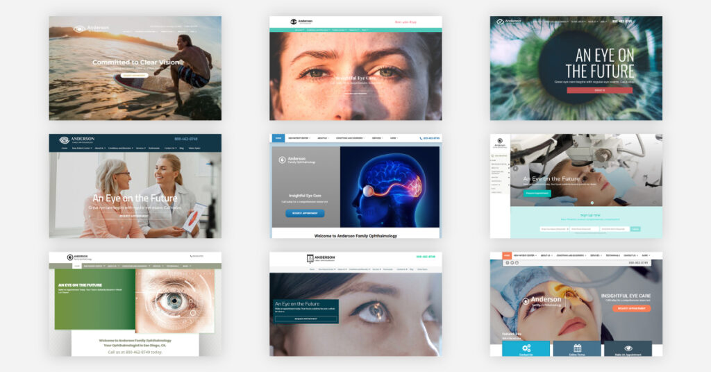
The 7 Best Ophthalmology Website Examples to Learn From
You do not need to reinvent the wheel. The strongest ophthalmology websites tend to solve one problem exceptionally well, and you can borrow the lesson without copying the look. Here are seven worth studying, each chosen for a different strength.
1. Acadia II- For Trust Signals
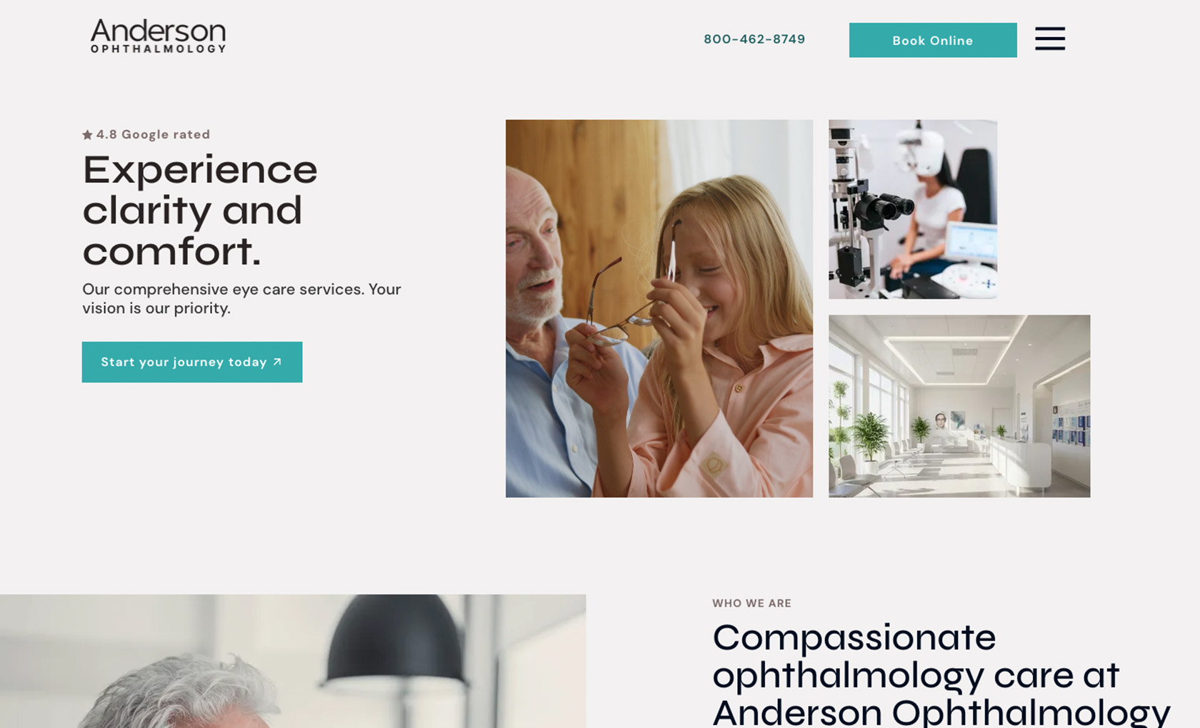
A clean, professional layout with generous white space, a Google rating badge in the header, patient reviews, and a full team section. It even adds a “Myth Busters” panel that clears up common eye care misconceptions. Use the Acadia template if you want a polished, credible feel and have a few doctors and reviews to show off.
2. Aspen – For a Deep Service Menu

Aspen sorts a long list of procedures, from LASIK and cataract surgery to corneal cross-linking and pediatric care, into a tidy dropdown, then backs it with simple “why choose us” blocks. A video hero version is available too. Choose this if you offer many subspecialty services and want patients to find each one fast.
3. Lisbon – For a Full-Featured Practice Site

Lisbon carries the most depth: a large navigation menu, a conditions and disorders library, an insurance section, a multi-doctor team carousel, and a newsletter signup. Use this if you are a larger group with several providers and plenty of educational pages to house.
4. Carmel – For Reviews and a Strong Call to Action
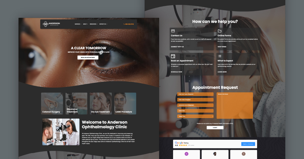
Carmel keeps the homepage simple, then leads with online reviews and a booking form. Its headline, “A Clear Tomorrow,” gives patients a reason to act. Borrow this if bookings are your single biggest goal.
5. Maui – For Services Up Front

Maui places four service tiles right at the top of the homepage, directly under the hero, so a visitor sees what you treat before scrolling. It keeps a single doctor in focus and a clean, organized flow. This fits practices that want their treatments visible in the first second.
4. Annapolis II – For a Patient-First Approach
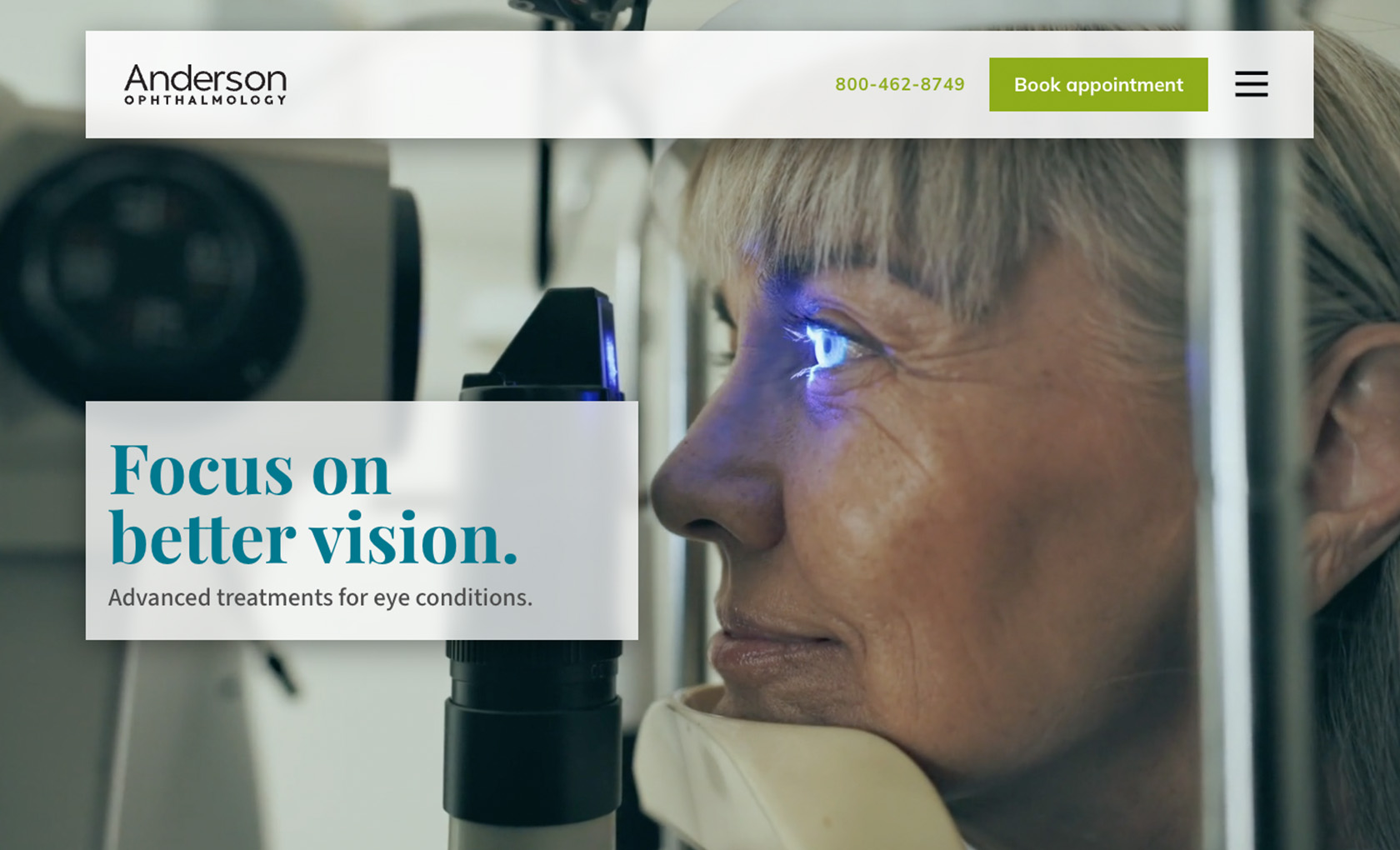
Annapolis II opens warm, with a sticky “Book Online” button and a featured ophthalmologist bio that introduces the person behind the care. It flows from your story into services, reviews, and contact details. Pick this when relationships and an approachable feel win you patients.
7. Del Mar – For Services in Image Blocks

Del Mar showcases core procedures such as cataract surgery, LASIK, and dry eye in clean image tiles, so patients can quickly see if you treat their condition. It works well for practices with a broad service menu. You can see these layouts and more in the iMatrix website design gallery.
Must Have Features Every Ophthalmology Practice Website Needs
Design gets patients interested. Features get them booked. Whatever look you choose, your website for an ophthalmology practice should include the following, and each one earns its spot for a reason.
Online appointment booking comes first, because a patient ready to schedule at 11 pm will not wait for office hours. Clear service pages matter next: give cataract surgery, LASIK, glaucoma, retina, and dry eye their own space so patients find their condition fast.
Doctor and staff bios with credentials build confidence, since patients want to know who will treat them. Patient reviews do the convincing you cannot do yourself. A large share of patients now read reviews before they ever call, so put your best ones where people can see them.
A few more features round out a complete site. List the insurance you accept, because cost is often the first question. Show your contact details with an embedded map, so a patient can find you without a second search.
Add an eye care blog or resource section to answer common questions and give search engines fresh content to rank. They are the difference between a brochure and a working tool for your practice.
All Modern Ophthalmology Websites Should Be Responsive
All modern ophthalmology websites should be responsive, which simply means the site adjusts to fit whatever screen a patient is holding. Most people will find you on a phone, so the phone version is the real version. Mobile devices now drive roughly 60 percent of all web traffic, and healthcare searches skew mobile even more.
On a responsive site, the layout resizes on its own, buttons stay large enough to tap with a thumb, and text stays readable without pinching or zooming. A patient should be able to book an appointment on their phone in the waiting room of another office without frustration. If they cannot, they move on.
There is a ranking reason too. Google looks at the mobile version of your site first when it decides where to place you in results. A site that struggles on phones will struggle to rank, no matter how polished it looks on a desktop. Responsive design is the baseline for being found and being usable.
Website Speed and Loading Performance
A slow website loses patients before they read a word. People expect a page to appear almost instantly, and every extra second of load time sends more of them back to search results to try someone else.
You do not need to understand the engineering to demand the results. Ask your web team for a few concrete things: pages that load in about two seconds on a phone, images compressed so they are sharp but not heavy, and a homepage that does not rely on a giant autoplaying video as the only thing a visitor sees.
Video is fine as a supporting piece. It is a problem when it blocks everything else from loading.
Performance also feeds your rankings. Google measures how fast and stable your pages feel to real users, and it rewards the sites that respect a patient’s time. Fix speed once, and it pays off twice, in more patients who stay and better placement in search.
Accessibility and Patient Privacy
An ophthalmology site carries a duty most websites do not. Many of your patients have low vision, and all of them are trusting you with personal health details. Design has to account for both.
Start with accessibility. Eye care patients skew older and often deal with reduced vision, color sensitivity, or a shaky grip on a phone.
Use strong color contrast so text stands out, font sizes large enough to read without effort, and navigation simple enough that no one gets lost. An accessible site reaches the exact patients you most want to serve.
Privacy is the other duty. A basic contact form that asks only for a name and phone number usually does not count as protected health information on its own.
The line gets crossed once a form pairs that identity with health details, such as an appointment request that asks for a reason for visit or a patient portal that stores conditions and history. Those forms should follow HIPAA practices, from encrypted, secure submission to a business associate agreement with any vendor that handles the data.
Patients may never see this work, but a breach turns a marketing asset into a legal problem overnight. Build it in from the start.
Ophthalmology Website Development Cost, Timeline, and Process
Let’s talk money and time, since that is what most practice owners actually want to know. Website development for an ophthalmology practice usually runs somewhere between a few thousand dollars for a template-based build and well into five figures for a fully custom site with many pages and features. Where you land depends on the number of pages, the level of custom design, and the features you need.
Timelines follow the same logic. A clean, template-based ophthalmology website can be ready in a few weeks. A larger custom project with multiple service pages, doctor bios, and integrations tends to take a couple of months from first call to launch. Rushing rarely helps. The review stage is where errors get caught.
The process itself is straightforward once you know the steps. You start by planning the pages and goals, move into design, then build the site, review it together and refine, and finally launch.
A good partner keeps you involved at each stage rather than disappearing until launch day. If you already have a site, ask for an honest audit first. Sometimes a refresh beats a rebuild.
How iMatrix Designs Websites for Eye Care Practices
Everything above is a lot to manage while you are also running a practice and seeing patients. That is the gap iMatrix fills.
We handle the full picture: proven design layouts like the ones in this guide, the features that book appointments, a responsive build that works on every phone, fast load times, accessibility, and HIPAA-minded privacy.
You do not have to guess whether your current clinic website measures up. Start with a free website audit, and we will show you exactly where your site is winning patients and where it is losing them. From there, we tailor a website that reflects your practice and helps more patients find you on Google.
If you would rather talk it through, call us at 888.792.8384 or click here, and we will point you toward the right plan and current pricing for your practice.
FAQs
How Much Does a Website Cost for Ophthalmology Practices?
Most ophthalmology websites cost from a few thousand dollars for a template-based design to well into five figures for a fully custom build. The final price depends on how many pages you need, how much custom design work is involved, and which features you add, such as online booking or multiple location pages.
How Long Does It Take to Build an Ophthalmology Website?
A template-based ophthalmology website is often ready in a few weeks. A larger custom site with many service pages, doctor bios, and integrations usually takes a couple of months. The biggest variable is how quickly you approve content and designs during the review stage.
What Should an Ophthalmology Website Include?
At a minimum: online appointment booking, clear service pages for treatments like cataract surgery and LASIK, doctor and staff bios with credentials, patient reviews, accepted insurance, contact details with a map, and a responsive web design that works on phones. An eye care blog helps you rank and answer patient questions.
Does My Ophthalmology Website Need to Be HIPAA Compliant?
It depends on what your forms collect. A form becomes subject to HIPAA when it pairs a patient’s identity with health information, such as an appointment request that asks for a reason for visit, or a patient portal.
A plain contact form asking only for a name and phone number usually falls below that line. For any form that does collect health details, follow HIPAA practices like encrypted, secure submission and a business associate agreement with your form vendor.
How Do I Make My Website Load Faster?
Compress your images so they stay sharp without slowing the page, remove heavy autoplaying video from the homepage, and ask your web team to clear out unused code. Aim for pages that load in around two seconds on a phone. Faster pages keep more patients and rank better on Google.
How Do I Make My Website Eye-Catching?
Keep it simple. Use plenty of white space, a clear navigation bar, intentional colors, and one strong headline that says what you do. Highlight your specialty and your best reviews, make the booking button easy to spot, and be sure the site loads fast on every device.