Optometry Website Design: 19 Proven Tips to Attract New Patients and Grow Your Practice
Most patients Google an eye care practice before they ever pick up the phone to book an appointment. Research shows 75% of people judge a business’s credibility based on its website design alone, which means your optometrist website creates a first impression long before your team says hello.
A strong online presence in 2026 goes well beyond how your site looks. With 77% of patients turning to reviews when searching for a new physician, 59.4% of internet traffic coming from mobile devices, and online booking driving up to 30% more appointments, your digital presence needs to work for your practice at every hour of the day.
This guide covers 19 proven tips across design, local SEO, content strategy, email marketing, and conversions. Whether you are evaluating your current site or building something new, each section gives your practice a clear, actionable step forward.
Why Optometry Website Design Matters for Your Digital Marketing
Your website sits at the center of your entire digital marketing strategy, and every other channel points back to it. Before a patient calls, checks your reviews, or follows you on social media, they visit your site first, and what they find there shapes every decision that follows.
A professional design builds credibility instantly, and that impression forms within seconds of a visitor landing on your page. Eye care professionals who invest in a clean, purposeful website signal trustworthiness at a glance, which directly influences whether a prospective patient books an appointment or moves on to another practice.
Strong web presence also reinforces local SEO, helping your practice rank higher in search results when patients look for an eye doctor nearby. As other optometry practices invest in their digital presence, a quality website keeps yours competitive, consistent, and visible to the right target audience.
Build an Eye Doctor Profile That Builds Credibility
Patients search for an eye doctor they can trust, and that trust begins with what they see on your website before they ever set foot in your office. A strong practice identity signals that you take your profession seriously, and it gives prospective patients a reason to choose you over the practice listed right below yours in search results.
1. Establish Your Brand Identity to Stand Out From Local Competitors
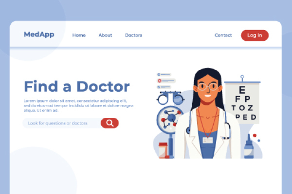
Your brand is more than a logo. A consistent color palette, font selection, and design language across every page of your site create a professional presence that patients recognize and remember. Start your homepage with a clear, compelling headline in 6 to 12 words that tells visitors exactly who you serve and what you offer, such as “Quality Eye Care For Your Family” or “[City] Eye Care + Optometry, See Clearly.”
2. Add Your Doctor Bio and Staff Photos to Build Credibility With New Patients
People search for a doctor they feel at ease with, and your website gives you the chance to make that connection in advance. A high-quality headshot paired with a genuine bio covering your training, specialties, and the reason you chose optometry gives prospective patients a clear picture of who they will meet. Adding a short practice tour video and staff team photos rounds out that introduction, showing new patients what your practice looks and feels like before their visit.
When prospective patients land on your website, they need to find relevant information about your practice without having to dig around for it. A clearly organized site does two things at once: it respects your visitors’ time, and it presents your practice as one that is straightforward to work with.
Showcase Your Eye Care Services and Practice Information Clearly
3. Organize Your Eye Care Services With Clear Website Navigation
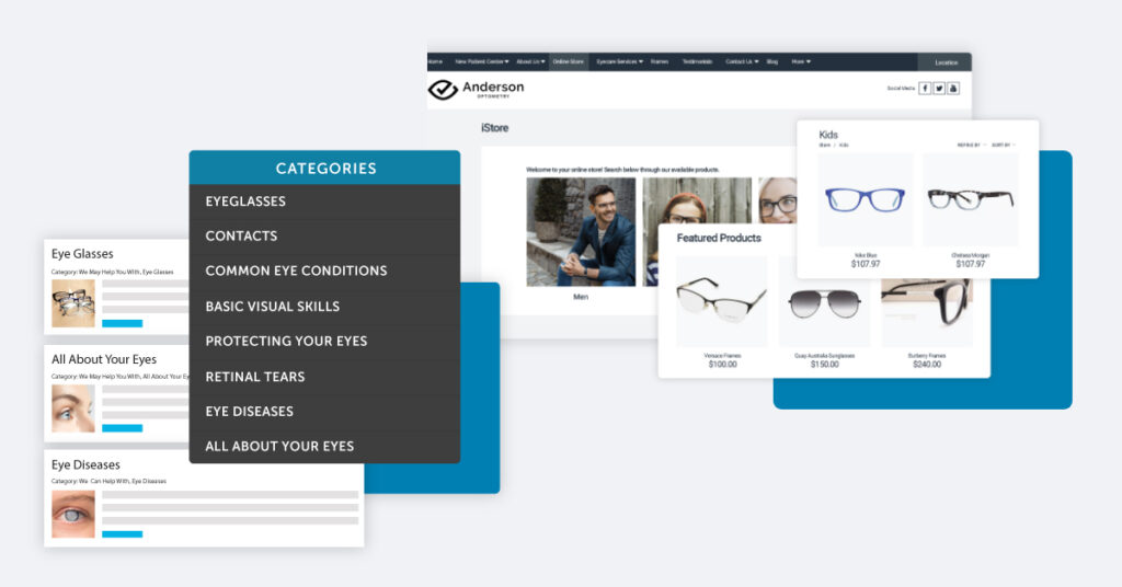
Your navigation menu is where patients begin, so every tab needs a clear purpose. Structure your site with dedicated pages for Eye Exams, Contact Lenses, Frames and Optical, Dry Eye, and Children’s Exams so patients can find the exact service they need without guessing.
Keep your menu to five to seven items in total, and include a Contact tab that links directly to your new patient forms, patient portal, and online booking option.
4. Display Practice and Insurance Information to Attract More New Patients
Patients who cannot quickly find your hours, phone number, or accepted insurance plans tend to leave your site and search elsewhere. Place your address, phone number, and operating hours in the header or footer of every page so the information stays easily accessible no matter where a visitor is browsing.
A click-to-call button on mobile makes contacting your office immediate, and listing all practice locations gives patients across your service area a clear reason to choose your practice over others.
Insurance information deserves dedicated space on your website, separate from your general contact page. Adding an insurance checker or verification tool takes that a step further, allowing patients to confirm their coverage before booking, which reduces cancellations and keeps your schedule running efficiently.
Design an Interactive Website With Contact Forms That Convert New Patients
A website that looks great but makes it difficult for patients to take action is not fulfilling its purpose. The design of your contact forms, booking tools, and interactive features directly determines how many visitors become actual booked appointments.
5. Add Contact Forms and Online Booking to Drive More Appointments
Practices that offer online booking see up to 30% more appointments than those that rely on phone calls alone. A booking tool with live availability and automated confirmations removes friction from the scheduling process and frees up your front desk staff at the same time.
Place a “Book Appointment” button in the upper section of your homepage, and keep your contact forms short and high converting on mobile by asking for Name, Phone, and Email only.
6. Use Popup Signup Forms to Capture New Patients
Popup signup forms give you a direct way to engage visitors before they leave your site. A simple message such as “We Are Now Accepting New Patients,” or a free first eye exam offer, can turn a passive visitor into a booked patient. During promotional periods, such as contact lens fittings or seasonal eye exam specials, targeted popups keep your messaging current and your schedule full.
7. Other Interactive Features That Drive Engagement
Small additions to your site can make a meaningful difference in how patients experience it. A live chat feature answers questions as they come up, and a directions tool linked to the patient’s location removes confusion for those visiting your practice for the first time.
A search bar on your blog helps returning patients find relevant content quickly, and uploading new patient intake forms to your site reduces paperwork and speeds up the arrival process.
Include High-Converting CTAs That Drive Traffic and Appointments
Bringing patients to your website is one step; what happens after they arrive determines whether they book or leave. A strategically placed call to action at every stage of the visit keeps that momentum moving toward an actual appointment.
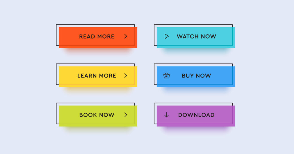
8. CTA Best Practices for Optometry Websites
Research shows that placing CTAs in every piece of content can increase your overall conversion rate by as much as 202%. The key is focus: limit each page to one primary CTA so visitors always know exactly what step to take next, rather than being pulled in multiple directions at once.
Effective options for optometry websites include Book Appointment, Free Eye Exam, Explore Frames, View Our Services, Request an Appointment, and Review Us, each one clear enough to stand on its own.
9. Keep Your Design Minimalistic So CTAs Stand Out
A cluttered page works against the very goal it is meant to support. When outdated promotions, retired staff bios, and pages that serve no clear purpose remain on your site, they fragment attention and bury your most important content. Google’s own research confirms that visual complexity negatively correlates with website appeal, meaning a cleaner site not only looks more professional but performs better too.
Removing unnecessary elements lets your CTAs breathe and makes it easier for your target audience to take the action you want. A simple navigation structure covering Eye Care Services, Online Store, Resources, Contact, and Patient Center gives every visitor a clear path forward. White space is not wasted space; it directs attention, reinforces professional design, and keeps your messaging easy to act on.
Drive Traffic With Educational Eye Care Content and a Blog Strategy
Publishing consistent content gives your practice a reason to show up in search results beyond your homepage. Every blog post, infographic, and video you create reaches a prospective patient who is already searching for answers about their eye health.
10. Publish Educational Eye Care Content to Drive Traffic and Build Authority
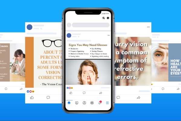
Educational content covering topics like dry eye, eye strain, children’s vision, contact lens care, and computer vision syndrome addresses the questions patients are already searching for. You can deliver that engaging content across multiple formats, including blog posts, ebooks, infographics, video series, and patient testimonials, to reach different segments of your audience.
Supporting your written content with infographics on topics like face shape and glasses, contacts versus glasses, or signs it is time for an eye exam makes information easier to absorb and more likely to be shared.
11. Add Video Content to Capture Attention and Build Trust
A third of all online activity involves watching video, and eye care practices that use it well stand out. Short animations covering common eye conditions, eye health tips, and product demos give patients something concrete to connect with, while a practice tour video and staff introductions help new patients feel familiar with your team before their first visit. Always use captions and avoid autoplay audio, which tends to drive visitors away rather than keep them engaged.

Optimize Your Optometry Website for Mobile to Reach New Patients on Any Device
With 59.4% of all internet traffic now coming from mobile devices, your website’s performance on a phone matters as much as how it looks on a desktop. Patients searching for an eye doctor nearby expect a site that loads quickly and adapts to any screen size, and a poor mobile experience sends them straight to a competing practice.

12. Make Your Website Mobile First to Attract New Patients
Visitors are five times more likely to leave a site that does not display well on mobile, which means responsive design is now essential. Your site should automatically adapt to phones, tablets, and desktops, with your phone number and address visible and clickable at the top of every mobile page.
Keep appointment forms simple on mobile by requesting only a name, phone number, and email address, removing every barrier between a visitor and a booked appointment.
13. Improve Website Speed to Reduce Bounce Rate and Boost Local SEO
The average user waits no longer than three seconds for a page to load before clicking away. Google’s 2026 Core Web Vitals targets set clear benchmarks: Largest Contentful Paint under 2.5 seconds, Cumulative Layout Shift under 0.1, and Interaction to Next Paint under 200 milliseconds.
Compressing images, removing unused Flash content, resolving JavaScript issues, and running regular checks through Google PageSpeed Insights are practical steps to help your practice rank higher in local search results.
Display Patient Reviews and Testimonials That Build Credibility
Patients choosing a new eye care provider rarely make that decision based on a website alone. Reviews and testimonials give them external validation, showing that real patients have had positive experiences at your practice long before a first appointment is booked.
14. Add Patient Reviews That Build Credibility and Convert New Patients
The numbers are clear: 77% of patients turn to reviews as their first step when searching for a new physician, and 94% of healthcare patients use online reviews to evaluate providers before booking.
Embedding Google reviews directly on your homepage or a dedicated testimonials page brings that social proof to where prospective patients are already looking. To grow your review count consistently, offer a simple incentive such as 50% off a future eye exam for patients who take the time to leave feedback.
15. Collect and Display Video Testimonials
Written reviews carry weight, but video testimonials give prospective patients something more personal to connect with. A short clip from a patient describing how their vision improved after getting new glasses or completing a contact lens fitting puts a real face and voice to the experience of visiting your practice. Placing these videos on your homepage gives new visitors immediate, believable social proof the moment they land on your site.

Choose the Right Color Scheme and Design Elements for Your Practice
The visual choices you make on your website communicate something about your practice before a patient reads a single word. Color, typography, spacing, and language all work together, and when they are consistent and purposeful, they build the kind of trust that keeps visitors on your site long enough to book an appointment.
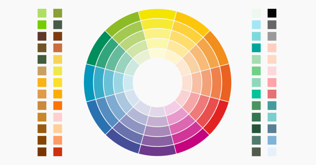
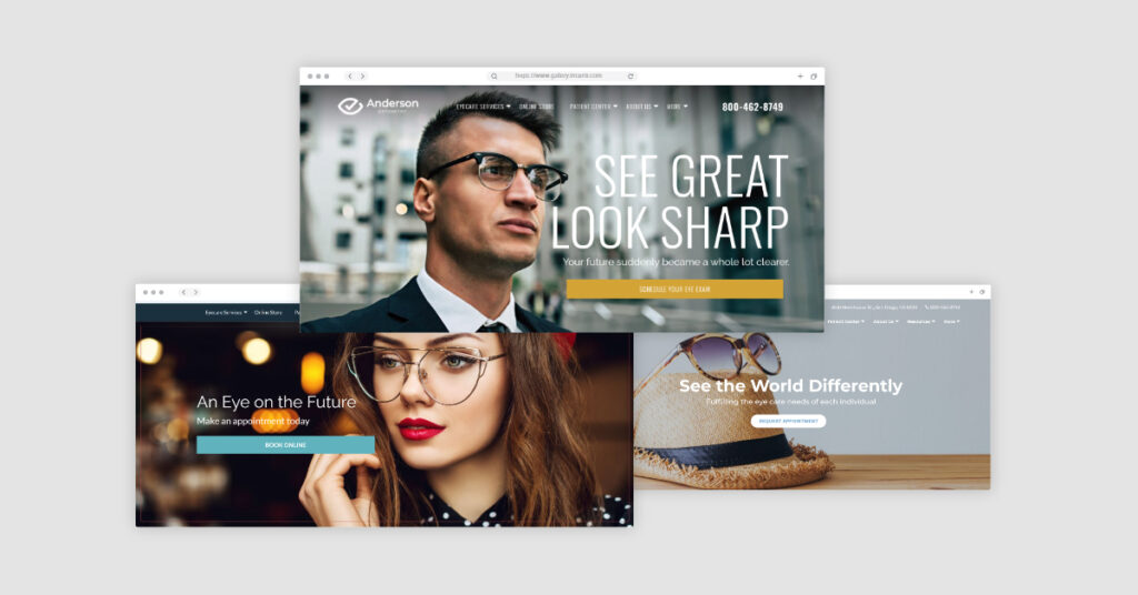
16. Use a Color Palette That Reflects Your Eye Care Brand
Color carries meaning, and in healthcare, that meaning matters. Blue communicates calm, trust, and security, which explains why it remains the most widely used color among healthcare businesses, while green signals health, growth, and healing for practices with a wellness focus.
Teal and turquoise offer a more contemporary option, blending sophistication with a sense of care, and whichever palette you choose should stay consistent across your website, business cards, and social media profiles.
17. Design Principles That Make an Optometry Website Feel Professional
A professional design goes beyond choosing the right colors. Limit your site to two fonts, one for headings and one for body copy, and use white space intentionally throughout each page, as Google’s own research confirms that visual complexity reduces website appeal.
Keep your icon style and illustration tone consistent across all pages, and write all content in plain language since most patients do not know clinical terms like “strabismus” for crossed eyes or “presbyopia” for farsightedness.
Follow ADA/WCAG Accessibility Standards
Web accessibility is not just a design consideration for optometry practices; it is now a legal requirement. Because many of your patients already live with some degree of vision impairment, building an accessible website is both a compliance obligation and a direct expression of the care you provide.
18. Why Web Accessibility Is Critical for Optometry Website Design
Federal regulations now require that most healthcare providers with 15 or more employees meet WCAG 2.1 Level AA standards by May 11, 2026. Smaller practices have until May 10, 2027, but starting the process now avoids a rushed and costly correction later.
Research examining leading ophthalmology hospital websites found that every single one contained accessibility issues, with poor color contrast being the most common problem and one that directly impacts patients who already struggle with their vision.

19. How to Make Your Eye Care Website Accessible
Start by adding an accessibility widget that gives visitors control over font size, color contrast, and text-to-speech functionality. Your color contrast ratios should meet minimum thresholds of 4.5:1 for standard body text and 3:1 for larger headings; all images need descriptive alt text, and every contact form should be navigable by keyboard. Running your site through Google Lighthouse or a dedicated WCAG audit tool gives you a clear picture of where your current site stands and what needs to be addressed first.
Hire Professionals to Execute Your Practice’s Design for You
Your optometry website should actively attract new patients, build credibility, and support every component of your digital marketing strategy. Meeting 2026 requirements around mobile speed, ADA accessibility, and local SEO is no longer optional, and practices that act on these now gain a real advantage over those that wait.
If you are ready to build or revamp your site, explore our eye care website services or browse our optometry website gallery to see what a quality site can achieve. Give us a call at 800.792.8384 or click here to learn more about our digital marketing services for optometry.
FAQs
How much does it cost to design an optometry website?
Website design costs range from a few hundred dollars for simpler builds to several thousand for fully custom sites with marketing integrations. Requesting a personalized quote is the best way to get an accurate figure for your specific needs.
How often should I update my optometry website?
Review your website content at least once a quarter to keep service information, hours, and promotions current. Plan a larger design refresh every two to three years to stay aligned with current standards and user expectations.
What pages should an optometry website have?
At minimum, include a homepage, services page, about us, contact page, and a blog. Adding pages for online booking, insurance information, patient forms, and specific services like dry eye or contact lens fittings makes your site significantly more useful.
How long does it take to see results from a website redesign?
SEO improvements from a redesign typically take three to six months to show up in search rankings. Conversion improvements — like more appointment requests — can appear more quickly once your new booking tools and CTAs are live.
What makes a good optometry website homepage?
A strong homepage clearly states who you are, what you offer, and how to book an appointment within the first visible section. High-quality photos, a compelling headline, and a visible booking button set the right foundation.
How do I make my optometry website HIPAA compliant?
Use encrypted contact forms for all patient inquiries, avoid storing patient data on your website server, and work with a hosting provider that meets HIPAA standards. Any booking or patient communication tools should also handle protected health information responsibly.
What is the best color scheme for an optometry website?
Blue is the most widely used color in healthcare because it communicates trust and calm. Pairing it with white or light gray gives a clean, professional look, while teal and green work well for practices with a wellness focus.