12 Ways to Improve Your Website User Experience
When you open search engines like Google and click on a particular website, you usually expect a pleaser user experience once you enter that site. Likewise, you would want your website’s user experience stellar for more people to be interested in your business. Whether you deliver easy navigational elements, fast loading speed, excellent content, or all of the above depends on your web design.
A good website should keep website visitors coming back. You should keep your potential customers in mind while designing your professional website. Simultaneously, you need to incorporate the website basics to keep them on your site for an extended period of time. The longer a user stays on your website, the more likely that person would interact with your content, check out your products or services, and potentially book an appointment.
Hence, your practice’s website should be functional, efficient, and aesthetically pleasing to visitors to maximize their time on your website. We want your business to generate as much interaction as possible.
Why Does Website User Experience Matter?

What’s the value in improving your website’s user experience? A good UX is crucial in increasing a user’s satisfaction with your website. This can also foster brand loyalty and engagement. On the other hand, a poor user experience can leave people feeling frustrated and confused. They might ultimately abandon your website altogether and move on to the next business.
How Can We Improve User Experience on Websites?
There are plenty of ways businesses can explore to take their website’s user experience to the next level. With so many ways to develop an artistic site, it can easily be overwhelming for people who aren’t experts in Google webmaster tools, and that’s fine.
We understand how challenging it is to develop a stellar web design. That’s why we’ve broken down some of the most user-experience best practices for your site. Here are 12 practical ways to improve website user experience.
1. Design for Your Target Audience
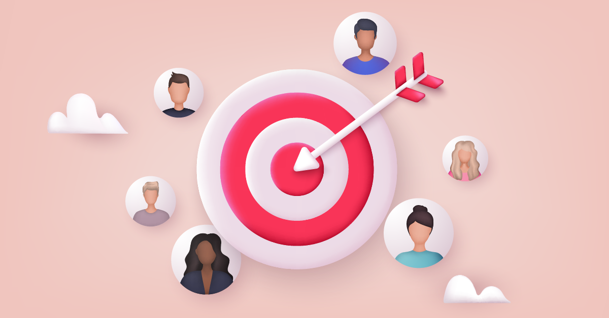
As you create your professional website, you should consider who your target audience is. Are you a healthcare professional aiming to attract more customers to your clinic? If so, research your target demographic and remember them as you choose your website design elements.
If you’re not appealing to the people you intend to reach, rethink your website structure. Understanding a particular audience segment means considering their age, location, gender, and other specifications as you design your website.
How easy is it to navigate your business website? What is the best typography to utilize? Which layouts should you use? You can answer these questions when you know what your target audience wants and value from a business.
Let’s say your business is targeting senior citizens. It would be best if you chose larger fonts and types that are easier for them to read. You shouldn’t select fonts that may be difficult to read, for older customers tend to have sight issues.
This is just one of the many design tips to consider as you build your business website. The more you know about your target demographic, the better you’ll be able to design to suit their needs.
2. Make the Navigation Bar Accessible
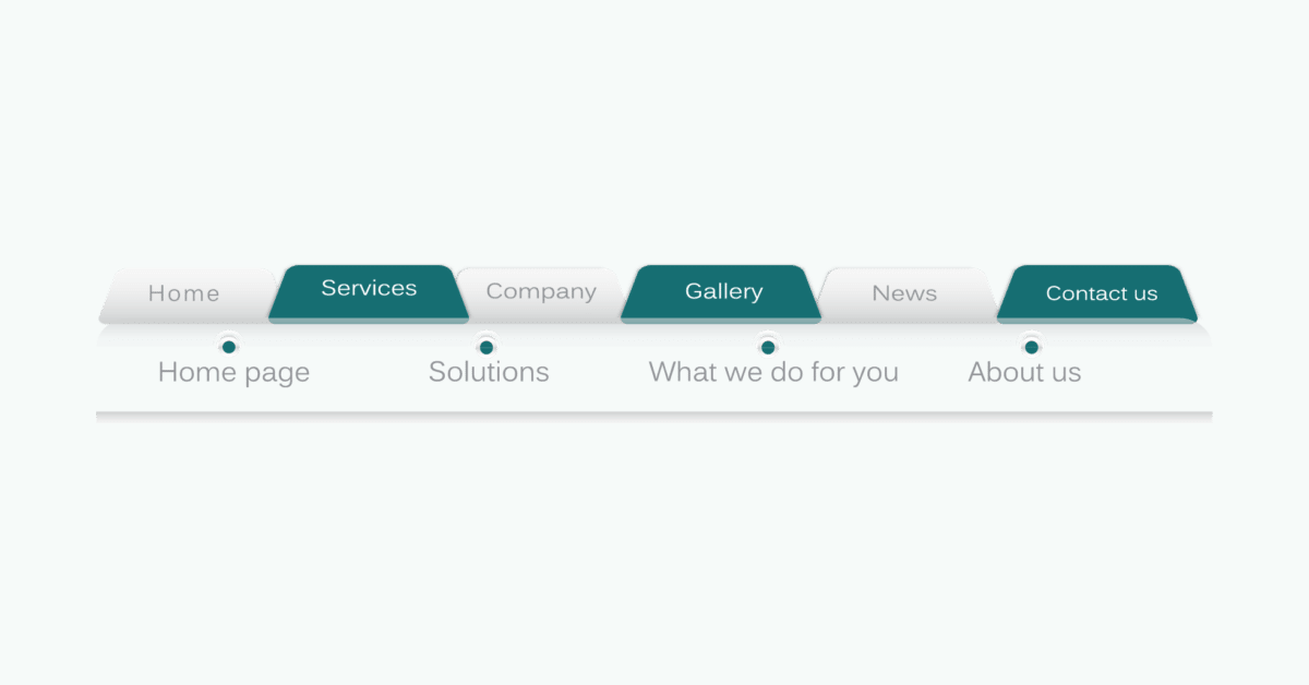
Finding one’s way around your website shouldn’t be challenging for site visitors. If they can’t find the website pages they’re looking for quickly, they might be deterred from staying on your website (and you wouldn’t want that). Creating an easily accessible navigation bar from every web page is the goal.
Navigation bars are usually placed horizontally at the very top of the web page. This is so site visitors can easily spot it and locate the exact web page they’re looking for. Whether it’s a fixed bar or one that moves up and down is entirely up to you.
Your navigation bar should include clear categories that allow visitors to find all the information they need about your practice. Home, About Us, and contact pages are customary for most business websites. However, you should feel free to add whatever categories best suit your users’ requirements.
3. Optimize for Faster Page Speed
When a person clicks on your website, how long does it take for your site to load? Your web page speed can make or break your rankings on search engines. Because of the influx of technological advances in recent years, most people have shorter attention spans than a goldfish. In fact, most people expect websites to have a load time of two seconds or less. Yes, you read that right. You have only two seconds to show your user experience.
What this means is that you don’t even get a full 10 seconds before people click out of your website and move on to the next one. If a person has to sit there and wait for your website to load for an extended period, then they might find another website with a user interface that is properly optimized.
Slow page load time interrupts one’s user experience. It can cause people a lot of frustration, and most people simply don’t have the time to wait. Regardless of how compelling your content is or how gorgeous your videos and photos are, if people have to wait too long to check your website, your bounce rate will increase dramatically.
You can reduce your image sizes, avoid including pop-ups, use external hosting services for larger files, and the like to avoid slow loading speed. Maximize websites that can help fast-track these processes so you don’t have to do them manually. Improving your loading time to a rate that satisfies you and your website visitors can be arduous, but it’s not impossible.
To determine your website’s current load time, you should run a speed test with all your plug-ins activated. After that, run another one with everything turned off. This process helps you determine the page load time difference, and you can adjust accordingly.
4. Create Quality Content

Like what marketing marvels always say, content is king. If you want everything on your professional website to be top-notch, why shouldn’t your content also be? Creating quality material that is both relevant and useful can help attract more prospective clients to your website.
Visitors will spend more time on your website if they’re reading a stellar blog post or watching videos with valuable information they can utilize. Having industry-specific blogs, videos, interviews, and other easily shareable content on social media platforms will also boost your website visibility.
Consider what kind of content your target demographic would find compelling and build a solid content strategy around those topics.
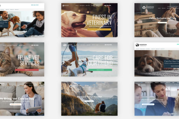
5. Harness the Power of Imagery
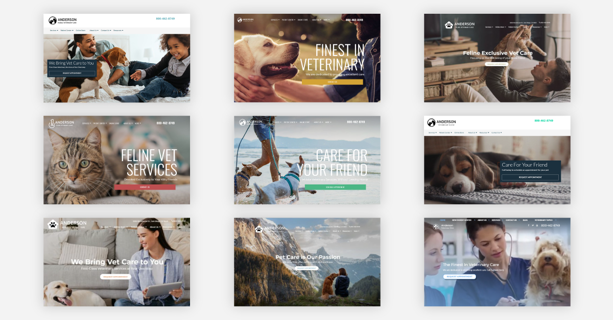
We know, we know, it’s a total cliché, but a picture is really worth a thousand words! Including visuals on your professional website that your audience finds attractive is an excellent way to keep them on your website. Choose relevant imagery to draw potential customers into your business and show them what you can do.
Let’s say you own a veterinary office. Most people would love to see photos of you and your staff interacting with animals. Add them to your website if you think they’d also be interested in graphics or other media types.
Images have the power to break up the text of any copy you have on your web pages. Most people don’t want to scroll and just read plain text. That’s boring! Spice it up by adding a touch of specialized images to pique their interest.
Another factor practice owners should consider regarding image choices: people online are getting smarter and quicker at judging a website before deciding if it’s worth exploring that website further. Upon visiting your website for the first time, they can easily determine if you’re using a stock photo they’ve already seen elsewhere. Using generic stock photos may decrease trust and doesn’t make your website appear unique.
Hence, investing in professional photography to take your website to the next level can yield excellent rewards. Using high-quality original photos can help make your website stand out and give your business website a personalized touch.
6. Ensure Mobile Compatibility
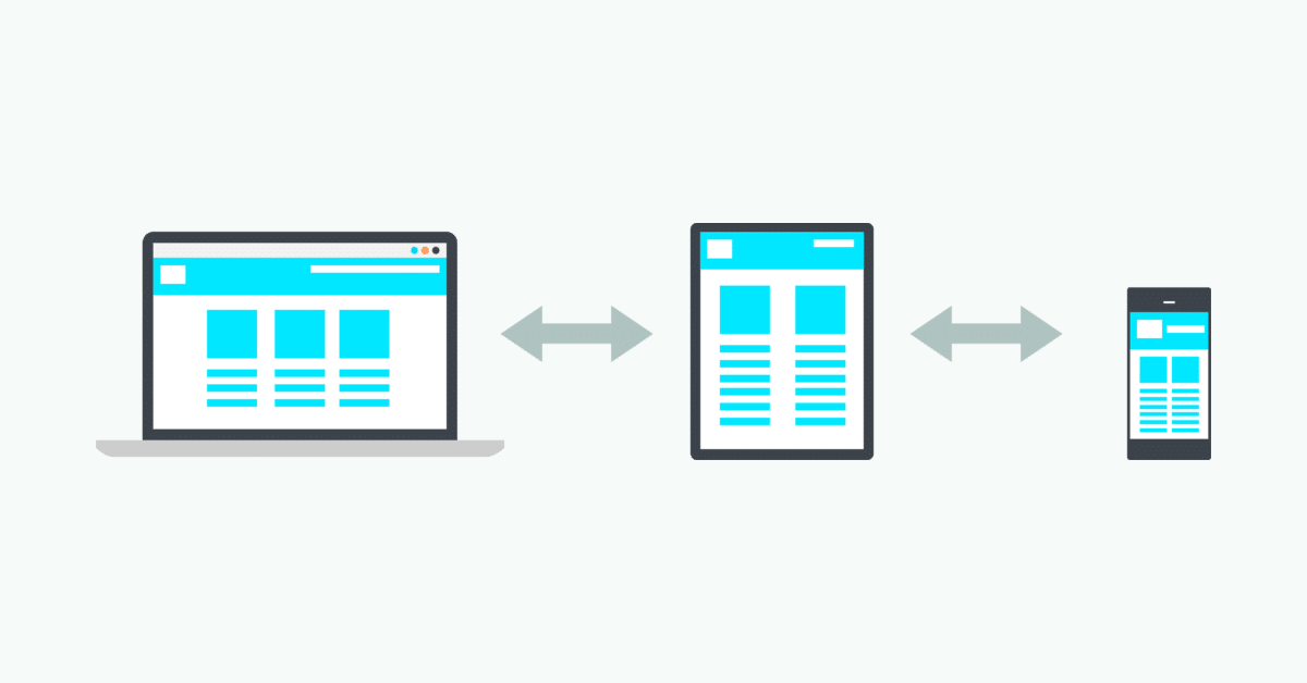
Mobile compatibility is one of the most essential elements that enhances one’s website user experience. Designing a mobile-friendly website is critical to attracting more people to your site.
More than half of people nowadays search on their smartphones or mobile devices. This means that you should not only optimize your website’s UX for desktops. It would be best to consider mobile devices when developing your user experience design process. If not, you’d be alienating a huge percentage of potential customers.
To ensure your website pages are compatible with mobile devices, you should account for responsive design (formatting for all screen sizes) and loading times on smart devices. Consider how all your website content and information will transfer to a smartphone.
You don’t want the desktop and mobile user interface to be different. This is why a responsive design can eliminate any significant differences.
7. Update Contact Information
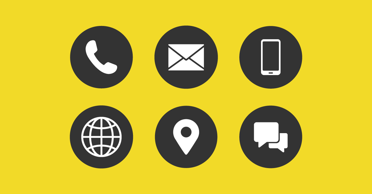
After browsing your websites and checking your key elements, what is the objective of website users? You want them to purchase a product or service from your business. The best way to do so is to ensure all your contact information is updated on your website.
Your practice’s operating hours, official contact e-mail address, clinic address, phone number, and social media pages should be easily accessible on your website. This is so potential clients can quickly contact your business regarding customer feedback or any questions about your business.
8. Use Attractive Calls to Action
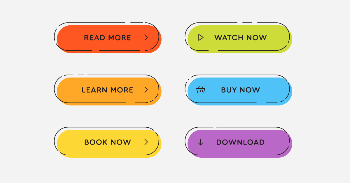
Something every business owner should understand: your website visitors are already accustomed to following visual cues to determine which content is relevant to them. Call to action buttons or CTA clearly marked with an action word allow your professional website to help visitors navigate your site and obtain precisely what they want in the location they expect to find it.
When creating CTA buttons for your site, you should reflect on color and the impact of the psychology of color. As per color psychology, colors have their own distinct messages. For example, green signifies health and growth, while yellow represents optimism and warmth. Blue stands for trust and strength, while white represents calmness and balance. Reflect on the message you want to invoke a user and choose the color of your CTA button styles wisely.
Another thing to consider when creating CTA buttons is the precise words you use for your buttons. The words you use should include a verb or action word that engages the user to perform a specific action. Choosing the right words or psychological triggers is determined by the emotional identification level that particular word prompts. No emotional connection means no action will be performed. Hence, you should make your word choices bold, time-sensitive, and goal-oriented.
CTA buttons encourage your site visitors to take the next step. Your job is to guide them in the right direction that will help your business grow. In the end, you and your site visitor wins.
9. Embrace White Space
In an era wherein users are bombarded with incredible visuals and flashy design elements, sometimes, simplicity is the key to improving website user experience. White space is essentially good for your website design. It makes your content more legible while enabling your visitors to focus on the elements that current your website text.
Using white space allows your website to appear fresher, more open, and modern. If your branding is consistent with these, then it can help you communicate better with your audience. On the other hand, white space quite literally does take up space.
If your goal is to get a lot of content above the fold or above the part that is immediately visible without scrolling, designing with too much white space might risk the exposure of valuable information. So how do you go about this? The key is to strike a balance between what’s important to communicate at the top of your web page and surround that area with some space so you can highlight the image or text.
10. Try Segmentation Through Bullet Points
There’s so much information that you want to share, but not everyone has the time or patience to read through all your content. Utilizing bullet points enables users to quickly obtain all the information they want: the benefits of supporting your business, how you can solve their pain points, and your products or services’ key features. They can find all these and more easily in a short period.
Bullet points allow your propositions to appear more attractive and help people to find all the information that they need. Moreover, you don’t have to go the traditional route with a simple circle.
There are plenty of stellar icons out there and you also have the freedom to get creative with your bullet. This will help users further through images that represent your point. Why should you do this? This forces you to isolate the most vital points you’re trying to make without getting caught up with the specifics or terms.
11. Create Targeted Headings
Your website’s heading and content should be driven by what your potential customers are on the lookout for. Strategic usage of keywords in your title is equally as vital for targeting your message and attracting the right people to your website.
Something you should remember: search engines usually give headings more weight than other content. Hence, you should choose the right heading, and making yours stand out can be incredibly helpful in improving your searchability. Moreover, headings help your audience be guided through your site, making it easier for them to scan and find content that speaks to them directly.
12. Watch Out for 404s
While search engines don’t punish professional websites for 404s or pages not found, a user will automatically get turned off and move on to the next website. When a user opens an image or link, they expect that link to take them to the next place they want to go.
In other words, encountering a 404 page can be annoying for people, and makes them rethink spending their precious time on your website. Next to slow loading time, encountering 404s can be an incredibly frustrating event for users, and disrupts their journey on your website.
To determine if you have any 404 pages, you can use Google webmaster tools on your site and crawl for errors. This tool allows you to save precious time as opposed to manually checking all your web pages. Who has the time to do that all the time, right?
Improve Website User Experience With iMatrix
It can be challenging to apply all these tips, and we totally get that. Fortunately, we at iMatrix are here to help you devise a stellar user experience to elevate your website. We can apply all the tips above and more. Call us at 800.792.8384 or click here to learn more about our services.
FAQs
What is the user experience of a website?
The user experience or UX of a website encompasses all aspects of a user’s interaction with the site, from the visual design and layout to the ease of navigation and the speed of loading. It also involves how straightforward it is for users to complete tasks, find information, or make transactions. A good user experience aims to provide a seamless, efficient, and enjoyable interaction that meets both the user’s needs and the business’s objectives.
What makes a great website user experience?
Basically, the website must be easy to use. People shouldn’t have to jump through hoops or wait too long to find exactly what they need from your website. In addition to being user-friendly, a great website should also be visually appealing and have well-organized content. It should offer intuitive navigation, load quickly, and be optimized for both desktop and mobile usage.