10 Website Design Basics for Healthcare Professionals
These days, it’s not enough to simply have a website. If we’re being honest, websites are a dime a dozen. However, a thoughtfully-designed, professional website can mean the difference between earning a new patient and losing a lead to a competitor.
People tend to form a first impression quickly. In fact, when prospective clients come into contact with your business, they tend to develop an opinion of your practice in as little as seven seconds. An opinion of your website can occur even more quickly. Studies show that people form a judgement about website design within 50 milliseconds. During that time, users will begin to decide whether they want to stay on your web page or jump to another site.
We know these statistics can be a little concerning. You may be thinking, “How am I supposed to impress my clients in a few seconds?!” That’s why we’re going to teach you how to do just that.
There are a handful of website design basics that can help healthcare professionals like you create an effective website that turns web traffic into appointments in your calendar. The best website designs share common elements that you can implement on your own site.
Stay tuned as we outline the 10 best website design tips and how they will impact your practice’s web presence.
10 Website Design Basics for Healthcare Professionals
From the visual appeal of your website to the functionality of your site navigation, there are countless ways you can design an effective healthcare website that gets results. Let’s get started.
1. Consider visual hierarchy.
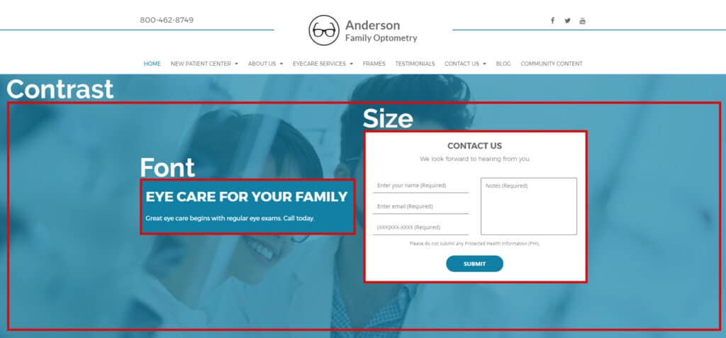
Visual hierarchy refers to the arrangement of visual elements, such as graphics, colors, and fonts, in order of importance. The goal of visual hierarchy is to direct the viewer’s attention to the most important parts of an image or web page to elicit a particular result.
In this case, the intention of your website’s visual hierarchy is to keep the web user on your page long enough to generate a conversion (turn a visitor into a client at your practice or, at the very least, an appointment on your calendar).
Here are some components of visual hierarchy to consider:
- Size – Draw the eye to the most important content by making those pieces larger than others on the page.
- Fonts – Catch readers’ attention by bolding phrases and making title tags larger than other fonts.
- Contrast – Use bold colors to draw the eye to certain elements on your page while muting the tones in the background.
2. Choose a minimal color scheme.
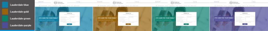
Not only does your color scheme contribute to the overall tone of your site, but can also be used to create brand consistency. When choosing a color scheme, stick to the “less is more” principle. Select between two and four colors to work with on your website. While there will be other colors that come into play, this primary color scheme will guide your custom graphics, landing page design, and other visual elements.
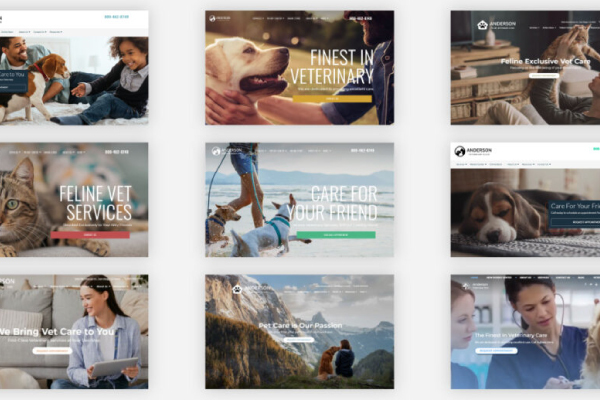
3. Graphics are everything.
When you’re flipping through a magazine or scrolling through your social feed, how often do you stop at the sight of an interesting image? Compelling images have the power to enhance our understanding of written material at a glance. They catch the reader’s attention, while the rest of the content reels them in.
If you have the option to use customized graphics and images, do it! As a local healthcare professional, you may want to consider investing in a professional photoshoot at your practice. You can use these images on your website, social channels, and business directory listings to create authority and inspire trust in potential patients.
4. Use consistent fonts.
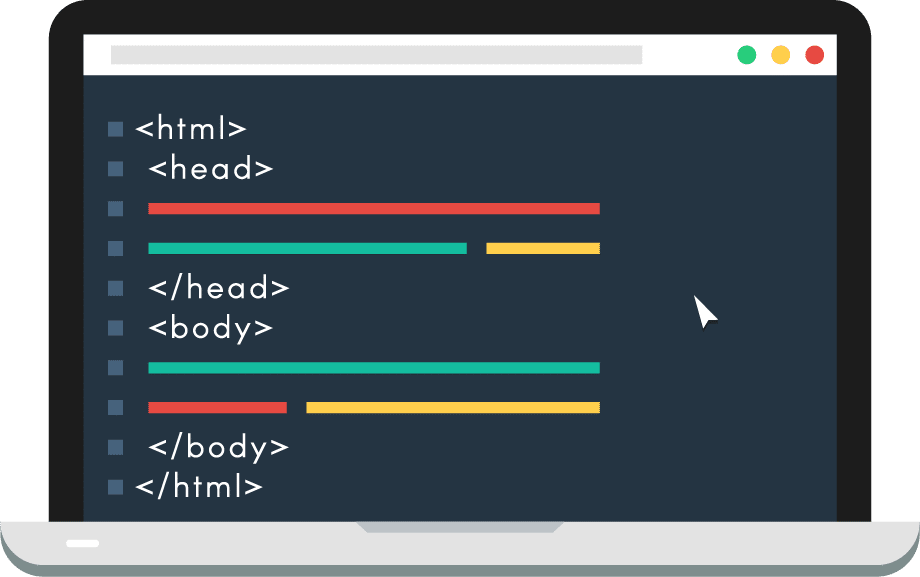 Rather than using an Arial font here and a Calibri font there, your website should maintain overall consistency in regards to typefaces. Before embarking on your web design journey, choose one or two typefaces that you will use for your content. These should be easily legible, so stay away from ornate fonts or script.
When formatting your content, use HTML title tags to outline headings and subheadings. Bonus points if you implement keywords into the title tags! This can help you improve your website’s search engine ranking and get found on Google in searches.
5. Make content easy to skim.
Face it. Not everyone has time to read your web page or blog word for word. So, make your content easy for the reader to skim and understand.
Try drafting descriptive HTML title tags so that a reader can easily find the information they are looking for. Your images should also clearly tie into your content so that readers get a better understanding of your page.
Break up text by using concise paragraphs. This will make reading your content less laborious for your audience.
6. Include calls-to-action.
A call-to-action, better known as a CTA in the marketing community, encourages your web visitor to take a specific action. For example, if you want a prospective client to make an appointment with you, feature a CTA that says something like, “Call now to make an appointment!”
The best website designs place a call-to-action on every page of their site. You may want to place your contact information in an easily accessible place on each page accompanied by words like, “Schedule Now,” or “Contact Us”.
7. Optimize for mobile or bust.
Considering over half of all internet searches originate from a mobile device, it’s essential that your website design is mobile-responsive. This means that when a web user accesses your site on a smartphone or tablet, the formatting of your web pages adjusts accordingly. Mobile-responsive sites will load quicker than traditional desktop sites on a mobile device due to the altered size of the content.
Mobile-optimized sites also rank higher when the search is made using a mobile device thanks to Google’s mobile-first indexing. Sites that fail to cater to mobile devices can incur a higher bounce rate, as smartphone users may quickly click out of a site that is hard to navigate on their device.

Mobile-optimization is especially important for local businesses. An amazing 78% of location-based mobile searches result in a purchase!
8. Prioritize site speed.
It’s not that people are inherently impatient, it’s just that when prospective clients are searching for your business, they want to find the information they need quickly. We all have busy lives, right? So, your website’s page speed should be up to par with your patients’ needs.
Web users expect your site to load in 2 seconds or less. Longer loading times may also contribute to an undesirable bounce rate. This can then negatively impact your search engine ranking. The lower your site’s search engine ranking, the lower the chance that new clients will be able to find your practice on Google.
9. Design user-friendly navigation.
We mentioned people like websites that are easy to use, right? Who doesn’t!
Design your website navigation bars so that current and prospective patients can easily find the information they need. Typically, the navigation bar will populate at the top of each page of your website.
![]()
We recommend creating individual pages for each of your specialties that are organized in a drop-down on your home page. You may also want to include an About Us page to introduce your staff, a blog to provide helpful resources, and a Contact Us page with your business information.
Make sure you are able to navigate from one page to the next without having to backtrack. That’s what your navigation menu is for!
10. Think like your ideal patient.
This may not be a design-specific tip, but it is essential to the success of your website. When a web user opens your website, do they immediately understand what you do? Can they quickly find your contact information? Will they be convinced to make an appointment at your office?
It’s easy to become so attached to your website that it’s difficult to think about it critically. You may want to ask a friend or family member for their unbiased opinion of your site, as they may be a good representation of your practice’s ideal demographic. Have them navigate to different pages on your site to discern how easy it is to use. You may get some valuable feedback!
Websites for Healthcare Professionals
If you’re feeling a little overwhelmed by this list, don’t worry, you don’t have to go it alone. Luckily, there are tons of services out there that enable you to create your own website, even if your degree has nothing to do with graphic design.
Better yet, search for a website provider that caters to your niche industry. We even happened to know a guy *eh hem*. Explore our page to learn how we can help you create a professional website and marketing solution that fits your practice’s unique needs.
Check out these other helpful healthcare marketing resources.
6 Ways to Tell It’s Time for a Website Redesign
10 Marketing Terms You’ve Probably Heard and What They Mean
7 Ways to Improve Your Website’s User Experience